library(tidyverse)
library(swac)

rheum <- read_csv("../data/rheum.csv")Points, Lines, and Trends
with {ggplot2}
R
Note
Coming soon: This page is currently being updated with standardized datasets and parallel Python examples.
Warning
Even among the pages being revised, this page is particularly messy. Please check back later.
Do bigger schools have bigger endowments? Scatterplots can make relationships like these visible, as shown in chapters 12–14 of Wilke’s Fundamentals of Data Visualization. By plotting enrollment against endowment for every SWAC school, we’ll learn how {ggplot2} can help us turn columns or decades of rows into insight.
As always, we’ll load packages and data before doing anything else.
It’s a good first step to take a look at the first few rows of data to see what it looks like.
head(rheum)Scatter plots with geom_point()
Scatter plots allow us to show associations among two or more quantitative variables. For instance, we might wonder whether older patients have passed more years since their arthritis diagnosis, and we can easily show this association:
rheum |>
  ggplot(aes(x = age,
             y = yrs_diagnosed)) +
  geom_point()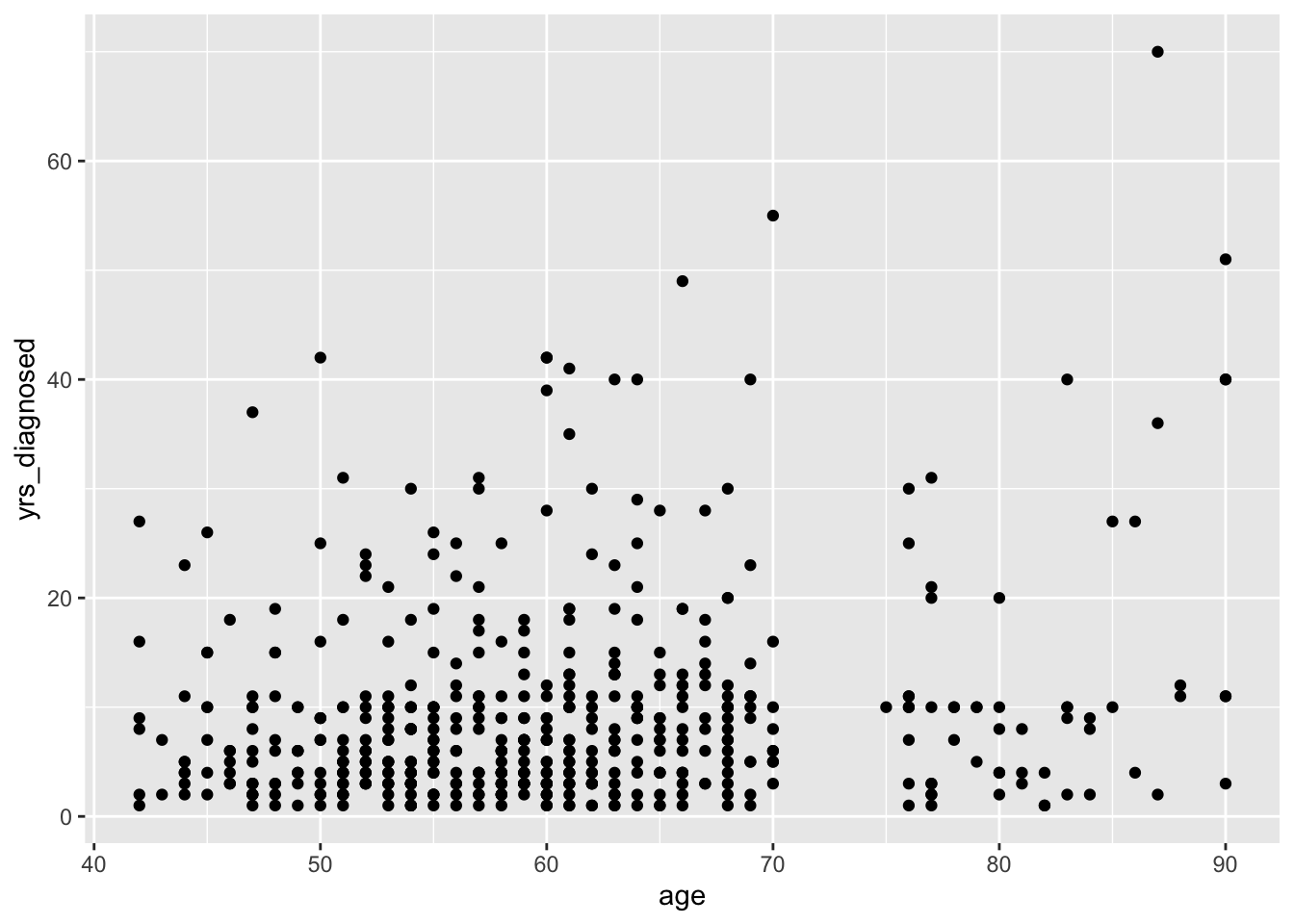
Clarifying overlapping dots
Some of these dots look they’re overlapping, which means they might not be seen. We can fix that problem a couple different ways.
Adding jitter with geom_jitter()
First, we can replace geom_point() with geom_jitter(), which will add a little bit of randomness to dots’ actual placements:
rheum |>
  ggplot(aes(x = age,
             y = yrs_diagnosed)) +
  geom_jitter()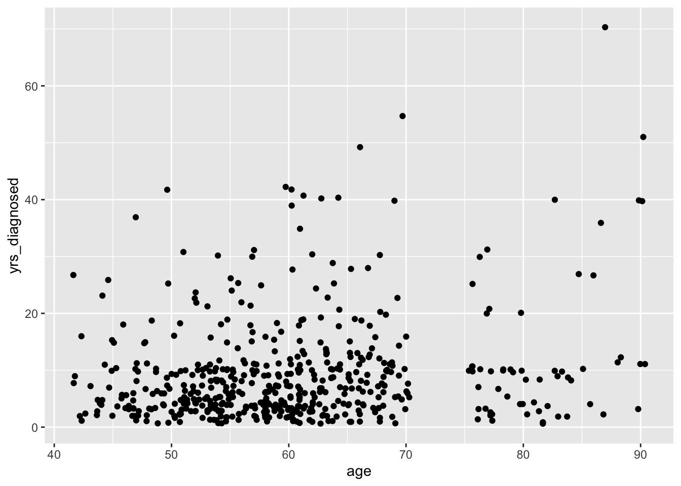
To further clarify overlap, we can add translucency. Setting an alpha value makes overlapping positions appear darker:
rheum |>
  ggplot(aes(x = age,
             y = yrs_diagnosed)) +
  geom_jitter(alpha = 0.4)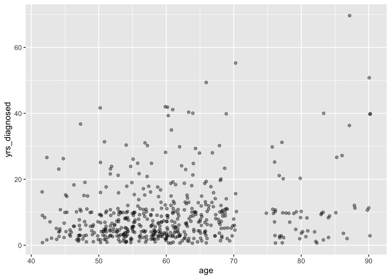
Instead of translucency, we might instead choose a dot shape that accepts both fill and outline colors. By default, {ggplot2} uses shape number 16 for dots, but other shapes are numbered here:

Any dot with a shape of 21 to 25 can accept both a fill and a color assignment. Here, we’re going to assign a fill of black with a color of white to get black dots with white outlines. While we’re at it, we can also define a size argument to make the dots a little bigger:
rheum |>
  ggplot(aes(x = age,
             y = yrs_diagnosed)) +
  geom_jitter(shape = 21,
              color = "white",
              fill = "black",
              size = 1.8)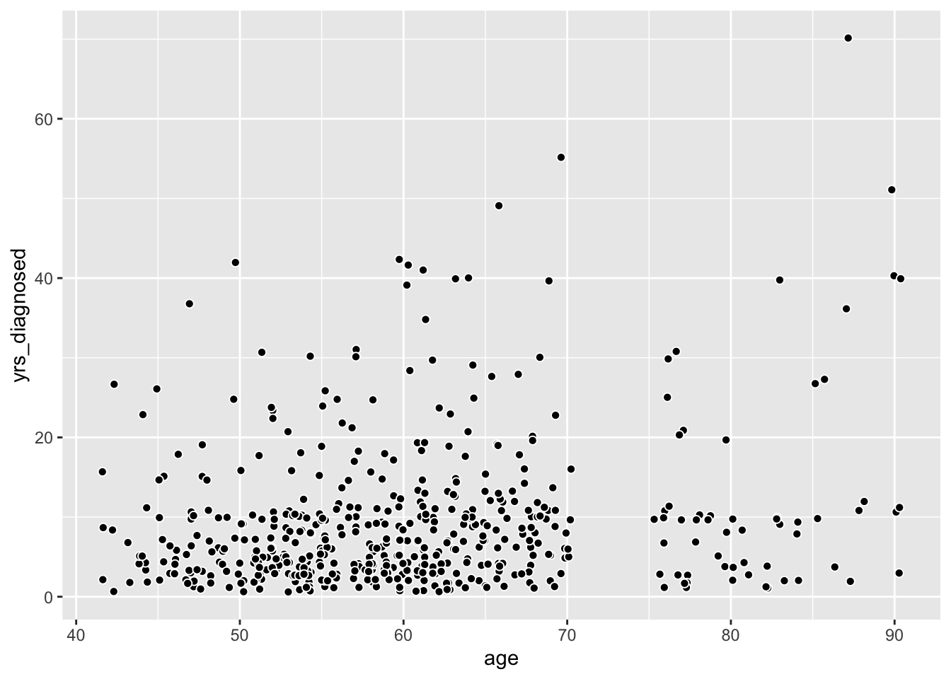
Counting overlaps with geom_count()
Instead of jittering dots, we can use geom_count() to adjust the size of each dot by the number of times those paired values are found in the data:
rheum |>
  ggplot(aes(x = age,
             y = yrs_diagnosed)) +
  geom_count(shape = 21,
             color = "white",
             fill = "black")
If we want to show both jitter and count, we can add a position argument to geom_count().
rheum |>
  ggplot(aes(x = age,
             y = yrs_diagnosed)) +
  geom_count(shape = 21,
             color = "white",
             fill = "black",
             position = "jitter")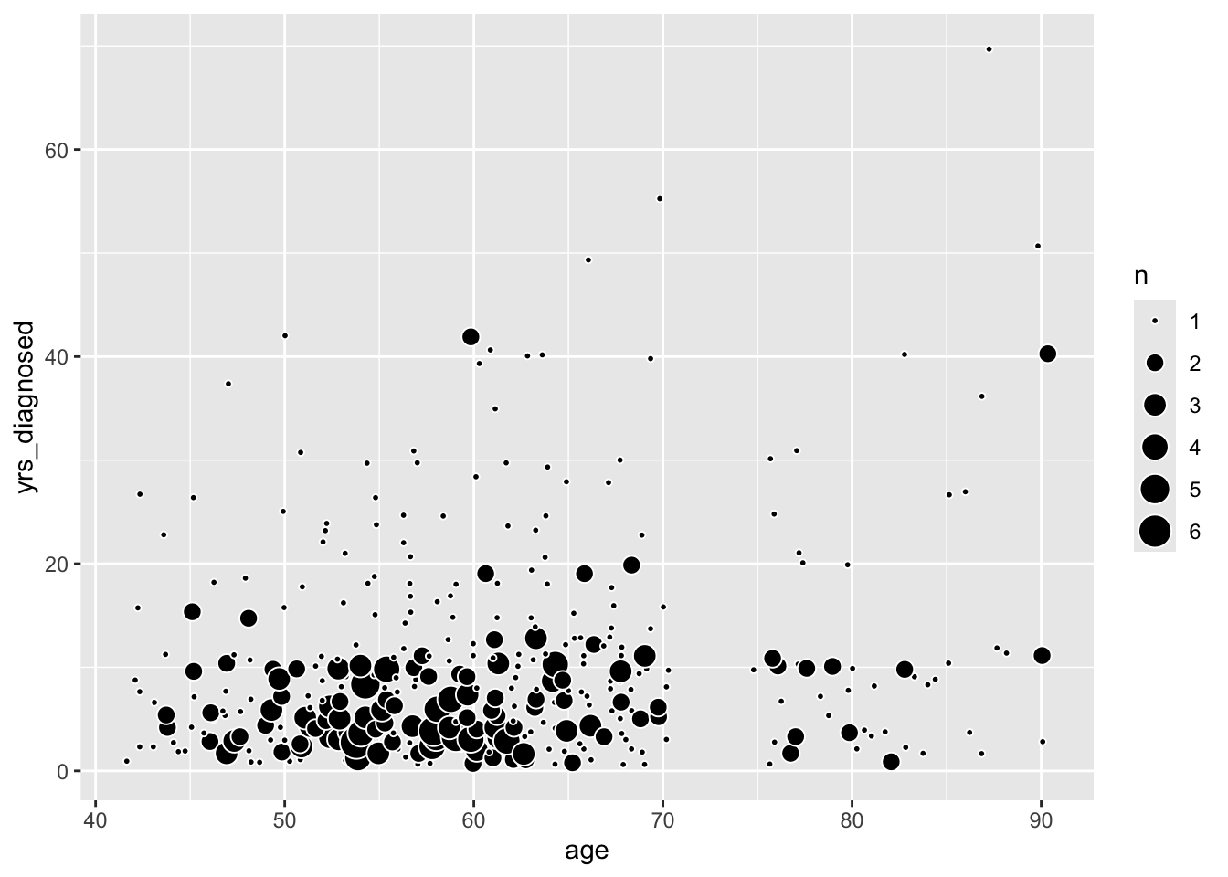
Adding another variable
To this chart, we can also add color by patients’ sex. Remember, if you want an aesthetic like color to change by values in a column, the definition needs to go inside the aes() function. Remember, too, that color for this dot shape defines their outlines, while fill describes the color inside.
rheum |>
  ggplot(aes(x = age,
             y = yrs_diagnosed,
             fill = sex)) +
  geom_jitter(shape = 21,
             color = "white",
             size = 1.8)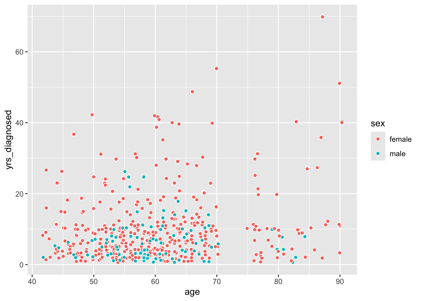
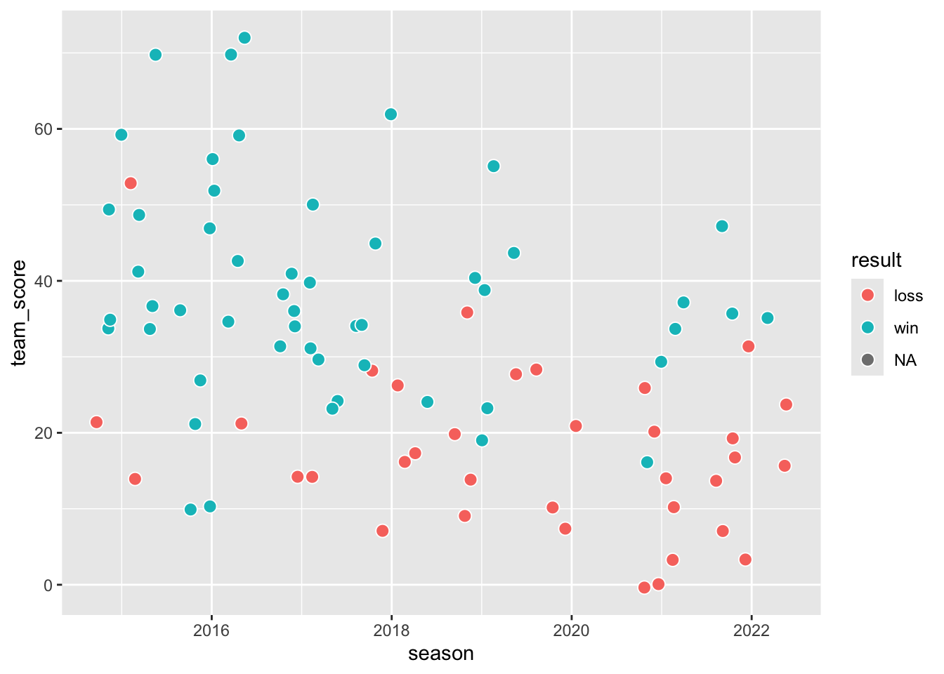
Scatter plots with multiple values
Let’s turn to a different data set to make a similar chart showing three columns:
football |>
mutate(
result = case_when(
team_score > opponent_score ~ "win",
team_score < opponent_score ~ "loss")) |>
ggplot(aes(x = opponent_score,
y = team_score,
fill = result)) +
geom_jitter(shape = 21,
color = "white",
size = 3)- 1
- These lines add a column called “result.” This column compares scores to indicate whether a game was won or lost.
- 2
-
Setting
fillto the new column will color each dot as a win or a loss.

It’s no surprise that wins become losses as values in opponent_score rise above values in team_score. It might be more illuminating to focus on some other column, like season:
football |>
mutate(
result = case_when(
team_score > opponent_score ~ "win",
team_score < opponent_score ~ "loss")) |>
filter(team == "Grambling State") |>
ggplot(aes(x = season,
y = team_score,
fill = result)) +
geom_jitter(shape = 21,
color = "white",
size = 3)- 1
- Time series data is typically mapped to the X-axis.
From here, we might even adjust the size of dots to show how big the audiences were to watch Grambling win or lose. Unfortunately, our data lacks audience sizes for seasons when Grambling had an exceptional record!
football |>
mutate(
result = case_when(
team_score > opponent_score ~ "win",
team_score < opponent_score ~ "loss")) |>
filter(
team == "Grambling State",
season >= 2018,
!is.na(result)) |>
ggplot(aes(
x = season,
y = team_score,
size = attendance,
fill = result)) +
geom_jitter(
shape = 21,
color = "white") +
labs(
x = NULL,
y = "points earned by Grambling",
title = "Grambling's best-attended games have lately been its losses.") +
scale_size(range = c(1, 8)) +
theme_minimal() +
theme(panel.grid.minor = element_blank()) +
guides(
fill = guide_legend(override.aes = list(
size = 4)),
size = guide_legend(override.aes = list(
fill = "gray",
color = "gray")))- 1
- Seasons before 2018 don’t have attendance, so we’re filtering them out here.
- 2
- Covid adjustments in the 2020 season made for some strange games that were neither wins nor losses. They’re dropped here to clarify the message.
- 3
-
The
sizeaesthetic, set here to the “attendance” column, will dynamically adjust dot sizes. - 4
-
By default, the
sizeadjustment ranges from sizes 1 to 6, butscale_size()allows for greater variation from the smallest to biggest dots. - 5
- Theme adjustments add polish at the end.
- 6
-
The
guides()function allows for adjustments to the legend. Here, the colored dot for wins and losses is enlarged, and the dots for attendance are colored a solid gray. Without this second adjustment, the dots have an empty fill and white outlines, making them invisible.

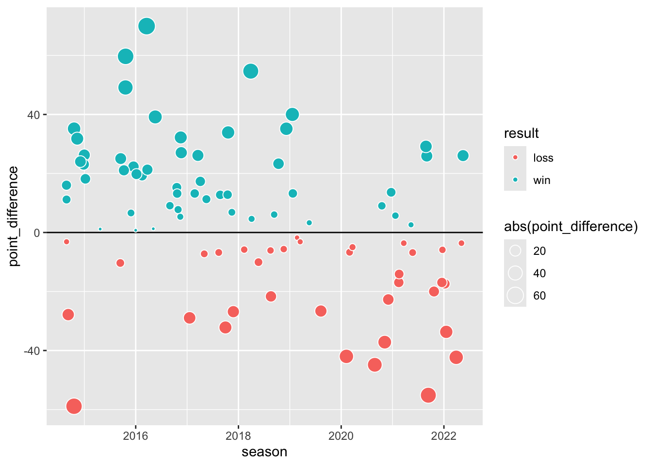
Trend lines
We might show similar data in a slightly different way, plotting wins above a center line and losses below. This makes a trend line sensible. Start first by by preparing a basic visualization:
gram_wins <-
football |>
mutate(
result = case_when(
team_score > opponent_score ~ "win",
team_score < opponent_score ~ "loss"),
point_difference = team_score - opponent_score) |>
filter(
team == "Grambling State",
!is.na(result)) |>
ggplot(aes(
x = season,
y = point_difference)) +
geom_abline(slope = 0, intercept = 0) +
geom_jitter(
aes(
size = abs(point_difference),
fill = result),
shape = 21,
color = "white")
gram_wins- 1
- This new column translates losses to negative values.
- 2
-
Use
geom_abline()to draw a line. Theslopeparameter defines its angle, with 0 for horizontal and 1 for 45 degrees. (Think of it as “run over rise,” or distance on the X-axis divided by distance on the Y-axis for each point on the line.) Theinterceptparameter indicates where the line should bump into the Y-axis. - 3
-
The
abs()function here stands for “absolute value.” It allows dots to grow when the point difference is further from zero, using smaller dots to indicate when a game was particularly close.
The geom_smooth() function adds an easy trend line:
gram_wins +
geom_smooth() 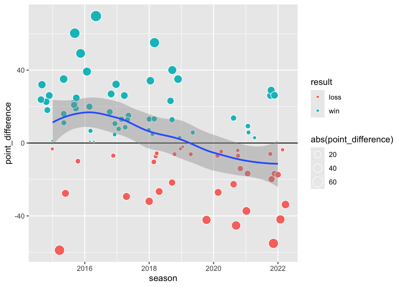
By default, the function will choose a method that best matches the data, typically presenting a curving line. Although we didn’t set it explicitly, the method shown here is called “loess.” Choosing a different method will change how this trend line is calculated. Straighten it by declaring method = "lm", which stands for “linear model.”
gram_wins +
  geom_smooth(method = "lm")
Once we have something that looks good, we can make it look great by cleaning it up. Remember that the order of layers determines which appears on top. Here, we’ll first layer the dashed line with geom_abline(), followed secondly by the trend line with geom_smooth(), and finally with the points using geom_jitter();
football |>
mutate(
result = case_when(
team_score > opponent_score ~ "win",
team_score < opponent_score ~ "loss"),
point_difference = team_score - opponent_score) |>
filter(
team == "Grambling State",
!is.na(result)) |>
ggplot(aes(
x = season,
y = point_difference)) +
geom_abline(
slope = 0,
intercept = 0,
linetype = "dashed") +
geom_smooth(method = "lm") +
geom_jitter(
aes(size = abs(point_difference),
fill = result),
shape = 21,
color = "white",
show.legend = FALSE) +
labs(
x = NULL,
y = "point advantage",
title = "Grambling's point advantage per game has been dropping.") +
theme_minimal() +
theme(
panel.grid.minor.x = element_blank(),
panel.grid.major.x = element_blank()
) +
scale_x_continuous(breaks = c(2015:2022)) +
scale_y_continuous(
sec.axis = dup_axis(
name = NULL,
breaks = c(-8, 0, 8),
labels = c("Lose", "Tie", "Win")))- 1
- Adjust line types to show hierarchy of importance or to differentiate among categories.
- 2
-
Because it uses direct labeling, the final chart doesn’t need a legend. We turn it off here with
show.legend = FALSE. - 3
-
Explicitly set axis labels by defining the
breaksparameter inscale_x_continuous()orscale_y_continuous(). - 4
- A secondary axis appears opposite the main axis. Here, we’re labeling the right-hand side to add context to the meaning of the Y-axis.
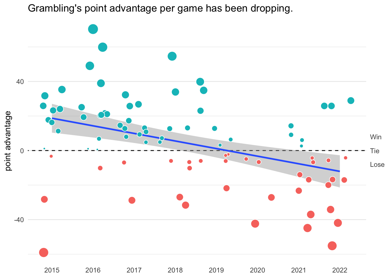
Slopegraph
Slope graphs are good for showing change over time for multiple items in a group. But a data sets is seldom well suited to create a slope graph by default.
swac_slope <-
football |>
mutate(
point_difference = team_score - opponent_score) |>
group_by(team, season) |>
summarize(
record = median(point_difference, na.rm = TRUE)) |>
ungroup()
swac_slope |>
ggplot(aes(
x = season,
y = record)) +
geom_line(aes(group = team)) +
geom_point(
shape = 21,
fill = "lightblue",
color = "white",
size = 4) +
geom_text(aes(label = team))- 1
- We need something for the Y-axis, so we’re defining “record” here as each team’s typical point difference for each season.
- 2
- This new column is used for the Y-axis, placing each team high or low depending on the number of points they typically scored in games each season.
- 3
-
Use
groupto indicate the column that should be matched when drawing the line.

We can improve the plot significantly by being choosy about the story it shows. For instance, we might be clearer by showing just two seasons and highlighting a single team:
swac_slope |>
filter(season %in% 2015:2016) |>
ggplot(aes(
x = season,
y = record)) +
geom_line(aes(group = team)) +
geom_text(
data = filter(swac_slope, season == 2015),
aes(label = team),
hjust = 1,
nudge_x = -0.04) +
geom_text(
data = filter(swac_slope, season == 2016),
aes(label = team),
hjust = 0,
nudge_x = 0.04) +
geom_point(
aes(fill = team == "Grambling State"),
shape = 21,
color = "white",
size = 4,
show.legend = FALSE) +
theme_minimal() +
theme(panel.grid = element_blank(),
axis.text.y = element_blank()) +
scale_x_continuous(
expand = expansion(add = c(0.7,0.7)),
breaks = 2015:2016,
position = "top") +
scale_fill_manual(values = c("darkgray", "red")) +
labs(
title = "Grambling's median point advantage per game improved in 2016.",
y = NULL,
x = NULL)- 1
- Limiting to two season cleans things up significantly.
- 2
-
Text labels are drawn here in two different layers. The
dataparameter in each is limited to a single year. - 3
-
The
hjustparameter indicates the horizontal justification for text labels. Use0for left alignment,1for right alignment, and0.5for centered labels. Similarly,nudge_xallows labels to bump left or right. - 4
- Setting an aesthetic to a logical test maps it to a logical value of TRUE or FALSE. This is a quick way to highlight a single group.
- 5
-
The
expandparameter adjusts how much space is shown on an axis beyond the maximum and minimum values. It’s needed here to accommodate the labels. - 6
- Contrasting with color saturation helps when highlighting one group. Here, red provides a clear contrast with gray to indicate the group being discussed.

This version of the chart is pretty good, but some of the labels are illegible. The ggrepel package offers the useful geom_text_repel() function to keep text from overlapping:
library(ggrepel)
swac_slope |>
filter(season %in% 2015:2016) |>
ggplot(aes(x = season,
y = record)) +
geom_line(aes(group = team)) +
geom_text_repel(
data = filter(swac_slope, season == 2015),
aes(label = team),
hjust = 1,
nudge_x = -0.06,
direction = "y") +
geom_text_repel(
data = filter(swac_slope, season == 2016),
aes(label = team),
hjust = 0,
nudge_x = 0.06,
direction = "y") +
geom_point(
aes(fill = team == "Grambling State"),
shape = 21,
color = "white",
size = 4,
show.legend = FALSE) +
theme_minimal() +
theme(
plot.title = element_text(hjust = 0.5),
panel.grid = element_blank(),
axis.text.y = element_blank()) +
scale_x_continuous(
expand = expansion(add = c(0.7,0.7)),
breaks = 2015:2016,
position = "top") +
scale_fill_manual(values = c("darkgray", "red")) +
labs(title = "Grambling's median point advantage per game improved in 2016.",
y = NULL,
x = NULL)- 1
-
The
geom_text_repel()function takes most of the same arguments asgeom_text(). - 2
-
Setting
directionlimits how labels are repelled. - 3
-
Center chart titles by adjusting
plot.titlein thetheme()function.
