library(tidyverse)
library(swac)

if (!file.exists("scorecard.rds")) {
  download.file("https://github.com/gadenbuie/scorecard-db/raw/refs/heads/main/data/tidy/scorecard.rds", "scorecard.rds")
}

if (!file.exists("school.rds")) {
  download.file("https://github.com/gadenbuie/scorecard-db/raw/refs/heads/main/data/tidy/school.rds", "school.rds")
}

scorecard <- readRDS("scorecard.rds")
school <- readRDS("school.rds") |>
  mutate(control = case_match(
    control,
    "Public" ~ "Public",
    "Nonprofit" ~ "Private (nonprofit)",
    "For-profit" ~ "Private (for profit)"
  ))

higher_ed <- school |>
  left_join(scorecard)

higher_ed_18 <- higher_ed |>
  filter(academic_year == "2018-19")

write_csv(higher_ed, "data/higher_ed.csv")
write_csv(universities, "data/universities.csv")Distributions
with {ggplot2} and {plotnine}
R
Python
How do SWAC schools compare to other schools for cost? A question like this may best be answered by considering the shape of data, not just by finding one number. Histograms, boxplots, and density curves show us whether scores cluster, stretch, or skew. They allow us to see whether a number is typical, on the high or low end, or far outside the norm. From chapter 7 through chapter 9, Wilke’s Fundamentals of Data Visualization discusses important considerations for showing these distributions and making clear their message. Here, we’ll go further and implement them in code.
These code explanations will be prepared using the scorecard and schools data sets from {scorecard-db}, drawn from data originally collated by the U.S. Department of Education, along with the universities data set from {swac}.
Prepare datasets in R and Python
from plotnine import (
  ggplot, aes, labs,
  geom_histogram, geom_density, geom_boxplot
)
import plotnine as p9
import pandas as pd

universities = pd.read_csv("data/universities.csv")
higher_ed = pd.read_csv("data/higher_ed.csv")
higher_ed_18 = higher_ed[higher_ed["academic_year"] == "2018-19"]
Histograms
A simple histogram made with geom_histogram() shows the most common price points students face in a particular academic year. By default, {ggplot2} will show data with 30 bins; for this data {plotnine} shows 91 bins:
cost_hist <-
  higher_ed_18 |>
  ggplot(
    mapping = aes(
      x = cost_avg)) +
  geom_histogram()

cost_hist
cost_hist = (
  higher_ed_18 >>
  ggplot(
    mapping = aes(
      x = "cost_avg"))
  + geom_histogram()
)

cost_hist.show()
This histogram shows a blocky curve rising sharply after zero on the X-axis and falling sharply just before around 50,000 on the X-axis. This X-axis shows the average cost endured by a university student, and the Y-axis shows the number of schools in the data set that hit that average cost. Each bar shows “binned” data, which means it pools together similar numbers. For example, if values ranged from zero to a hundred, a histogram with 20 bars would group together values 0 to 4, 5 to 9, and so on.
A histogram’s highest point lets us see the most common bin of values—in this case, the most common cost_avg looks to be around $15,000—and the width of the curve shows how likely numbers will cluster around a common value. Sometimes a histogram has a really wide curve, suggesting a lot of variance in the data; in this case, our curve looks tall and skinny, which tells us that universities tend to cluster around that common average cost.
Note
Barely perceptible in this histogram—but shown by the X-axis—is the long tail to the right. Beyond the $60,000 mark, we get just a few tiny blips above $105,000. Between those blips and the larger curve are empty spaces. Within that empty space, the number of schools in each bin is too small to make a mark on the vertical scale. It’s probably zero, but we’d be wise to check the data to be sure.
Setting bin number or width
Defaults can be changed by manually setting the number of bins or their width. Choosing something suited to the data guarantees as particular output and helps us better understand what it might show.
The bins argument sets the number of bars to divide up things. Because every bin will be the same size and they’ll stretch for the full range of data, some bins might have zero schools in them.
cost_hist <-
  higher_ed_18 |>
  ggplot(
    mapping = aes(
      x = cost_avg)) +
  geom_histogram(
    bins = 50
  )

cost_hist
cost_hist = (
  higher_ed_18 >>
  ggplot(
    mapping = aes(
      x = "cost_avg"))
  + geom_histogram(
    bins = 50
  )
)

cost_hist.show()
Instead of setting the number of bins, we can instead set the range of each with binwidth. This is helpful for breaking down numbers into human-friendly ranges. For instance, we might perhaps best understand college costs in bins of $5,000:
cost_hist <-
  higher_ed_18 |>
  ggplot(
    mapping = aes(
      x = cost_avg)) +
  geom_histogram(
    binwidth = 5000
  )

cost_hist
cost_hist = (
  higher_ed_18 >>
  ggplot(
    mapping = aes(
      x = "cost_avg"))
  + geom_histogram(
    binwidth = 5000
  )
)

cost_hist.show()
Finishing with polish
As always, we keep three points in mind when preparing visualizations:
- Accuracy
- Message
- Beauty
Our visualization and data don’t get into any funny business, so we’ve probably already hit the mark for accuracy. (But see the note below!) We could nevertheless do more to clarify a message, and we haven’t yet made choices to enhance its beauty.
Adding a title and tweaking labels will improve the message, but that’s not enough to fix problems with values on the X-axis. With a binwidth = 5000, the first bin range should cover 0 to 4999, but it’s shown as centered on 0. We can fix this by changing the center of bins to a value that’s half of our binwidth.
Additionally, while each bar shows a nice, understandable $5,000 chunk of cost, it’s undistinguishable from its neighbors. Setting a color will add borders making each bar’s offset countable from the labels on the X-axis; at the same time, we’ll set fill to a money-themed green, with transparency allowing horizontal grid lines to show through for context.
Code defining abbrev_dollar()
abbrev_dollar <- function(n) {
  case_when(
    n >= 10^6 ~ round(n/(10^6), 1) |> paste0("M"),
    n >= 10^3 ~ round(n/(10^3), 1) |> paste0("K"),
    .default = as.character(n)
  ) |>
    {\(x) paste0("$", x)}()
}library(scales)
cost_hist <-
higher_ed_18 |>
ggplot(
mapping = aes(
x = cost_avg)) +
geom_histogram(
center = 2500,
binwidth = 5000,
color = "black",
fill = "forestgreen",
alpha = 0.4) +
labs(
title = "Average cost of U.S. higher education, AY 2018-2019",
subtitle = "The most common price point was in the range of $15,000 to 20,000.",
x = "average cost",
y = "schools") +
theme_linedraw() +
scale_y_continuous(
expand = expansion(mult = c(0,0.01)),
labels = label_comma()) +
scale_x_continuous(labels = abbrev_dollar) #+
# theme(plot.margin = unit(c(0.17, 0.37, 0.17, 0.17), "cm"))
cost_hist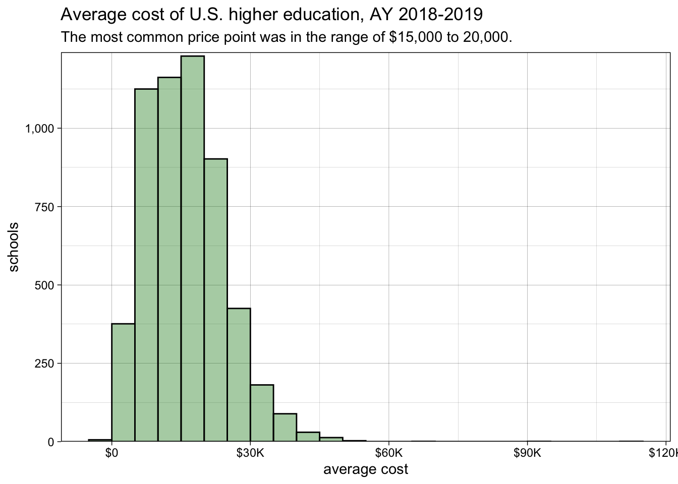
Code defining abbrev_dollar()
def abbrev_dollar(number):
  result = []
  for n in number:
    if n >= 10**6:
      result.append(f"${n / (10**6):.0f}M")
    if n >= 10**3:
      result.append(f"${n / (10**3):.0f}K")
    else:
      result.append(f"${n:.0f}")
  return result
import mizani.labels as ml
cost_hist = (
higher_ed_18 >>
ggplot(
mapping = aes(
x = "cost_avg"))
+ geom_histogram(
center = 2500,
binwidth = 5000,
color = "black",
fill = "forestgreen",
alpha = 0.4)
+ labs(
title = "Average cost of U.S. higher education, AY 2018-2019",
subtitle = "The most common price point was in the range of $15,000 to 20,000.",
x = "average cost",
y = "schools")
+ p9.theme_linedraw()
+ p9.scale_y_continuous(
labels=ml.comma_format(),
expand = [0,0,0.05,0]
)
+ p9.scale_x_continuous(labels = abbrev_dollar)
)
cost_hist.show()
Strip plots
If we want something more than a histogram, we might first consider direct representation of data with points using geom_point(). This instinct is good, but it has limitations:
cost_point <-
  higher_ed_18 |>
  ggplot(
    mapping = aes(
      x = reorder(control, cost_avg, na.rm = TRUE),
      y = cost_avg)) +
  geom_point(
    mapping = aes(color = control),
    show.legend = FALSE)

cost_point
import numpy as np

cost_points = (
  higher_ed_18 >>
  ggplot(
    mapping = aes(
      x = "reorder(control, cost_avg, np.mean)",
      y = "cost_avg"))
  + p9.geom_point(
    mapping = aes(color = "control"),
    show_legend = False)
)

cost_points.show()
The overlap of points makes it difficult to see how many there are. We can get a better representation of the distribution by adding jitter with geom_jitter() and transparency with an alpha value.
cost_point <-
  higher_ed_18 |>
  ggplot(
    mapping = aes(
      x = reorder(control, cost_avg, na.rm = TRUE),
      y = cost_avg)) +
  geom_jitter(
    mapping = aes(color = control),
    alpha = 0.3,
    show.legend = FALSE)

cost_point
cost_points = (
  higher_ed_18 >>
  ggplot(
    mapping = aes(
      x = "reorder(control, cost_avg, np.mean)",
      y = "cost_avg"))
  + p9.geom_jitter(
    mapping = aes(color = "control"),
    alpha = 0.3,
    show_legend = False)
)

cost_points.show()
With a strip plot that uses jitter, the distribution of values is conveyed in the density of points.
Sina plots
Points represented with geom_jitter(), will fall randomly, which makes things look a little inconsistent. If we instead stack the points up from the center line and outward, we get a cleaner shape that shows the distribution of values in the width of the curves. This kind of plot is called a sina plot.
In R, we use geom_sina() from {ggforce} to make simple sina plots.
library(ggforce)
cost_sina <-
higher_ed_18 |>
ggplot(
mapping = aes(
x = reorder(control, cost_avg, na.rm = TRUE),
y = cost_avg)) +
geom_sina(
mapping = aes(fill = control),
shape = 21,
show.legend = FALSE)
cost_sina- 1
-
By definining the
shapeas something between 21 and 25, we’re choosing points that take acolorfor the border andfillfor the inside. If we instead usecolorwithout defining a shape, we’ll struggle to see individual points.

In Python, {plotnine} includes a native geom_sina() for sina plots.
cost_sina = (
  higher_ed_18 >>
  ggplot(
    mapping = aes(
      x = "reorder(control, cost_avg, np.mean)",
      y = "cost_avg"))
  + p9.geom_sina(
    mapping = aes(fill = "control"),
    show_legend = False)
)

cost_sina.show()
Violin plots
If the points themselves aren’t as important as their general shape, a violin plot made with geom_violin() conveys the same information.
cost_violin <-
  higher_ed_18 |>
  ggplot(
    mapping = aes(
      x = reorder(control, cost_avg, na.rm = TRUE),
      y = cost_avg)) +
  geom_violin(
    mapping = aes(fill = control),
    show.legend = FALSE) +
  labs(
    title = "Average cost of U.S. higher education, AY 2018-2019",
    subtitle = "More than three quarters of public schools had costs below $15,000.",
    x = NULL,
    y = "average cost") +
  scale_y_continuous(labels = abbrev_dollar) +
  theme_minimal() +
  theme(panel.grid.major.x = element_blank())

cost_violin
cost_violin = (
  higher_ed_18 >>
  ggplot(
    mapping = aes(
      x = "reorder(control, cost_avg, np.mean)",
      y = "cost_avg"))
  + p9.geom_violin(
    mapping = aes(fill = "control"),
    show_legend = False)
)

cost_violin.show()
Boxplots
Another alternative is a boxplot, which conveys many statistics in a visual form. All of these statistics are calculated automatically with geom_boxplot().
cost_box <-
  higher_ed_18 |>
  ggplot(
    mapping = aes(
      x = reorder(control, cost_avg, na.rm = TRUE),
      y = cost_avg)) +
  geom_boxplot(
    mapping = aes(fill = control),
    show.legend = FALSE) +
  labs(
    title = "Average cost of U.S. higher education, AY 2018-2019",
    subtitle = "More than three quarters of public schools had costs below $15,000.",
    x = NULL,
    y = "average cost") +
  scale_y_continuous(labels = abbrev_dollar) +
  theme_minimal() +
  theme(panel.grid.major.x = element_blank())

cost_box
cost_box = (
  higher_ed_18 >>
  ggplot(
    mapping = aes(
      x = "reorder(control, cost_avg, np.mean)",
      y = "cost_avg"))
  + geom_boxplot(
    mapping = aes(
      fill = "control"),
    show_legend = False
    )
  + labs(
    title = "Average cost of U.S. higher education, AY 2018-2019",
    subtitle = "More than three quarters of public schools had costs below $15,000.",
    x = "",
    y = "average cost")
  + p9.scale_y_continuous(labels = abbrev_dollar)
  + p9.theme_minimal()
  + p9.theme(panel_grid_major_x = p9.element_blank())
)

cost_box.show()
Reading a boxplot requires a little background knowledge. While boxplots satisfy many of the same objectives as density curves, they more clearly indicate certain statistics like median, range, interquartile range, and outliers.
These statistics allow us to better understand the boxplots in the figure above, which shows the stark difference in costs between public and private colleges and universities. In each boxplot, the central box indicates the middle 50% of values. For public schools, the box is wholly below $15,000, so more than 75% of those schools cost less than that amount. Meanwhile, for private not-for-profit colleges and universities, the central box is wholly above $15,000, so more than 75% of those schools exceed that threshhold.
Density curves
Boxplots and histograms are helpful for showing counts and other summary statistics, but they may not be the best way to answer our original question—“how do SWAC schools compare to other schools for cost?” Density curves serve the moment when the general shape of data is more important than specific numbers. They’re visualized with geom_density().
cost_dens <-
  higher_ed_18 |>
  ggplot(mapping = aes(x = cost_avg)) +
  geom_density()

cost_dens
cost_dens = (
  higher_ed_18 >>
  ggplot(mapping = aes(x = "cost_avg"))
  + geom_density()
)

cost_dens.show()
In its default form, a density plot is a rather unsatisfying squiggle. Values on the Y-axis show a number for “density”—a unit which changes with every chart shape to make the area under the curve equivalent to 1—but even these unintuitive values could at least be shown in decimals. Moreover, when following the principle of proportional ink, the area under the curve really should be filled in. Other decisions we made for the histogram work well for a density curve, too.
Tip
To get something more meaningful on the Y-axis, showing numbers of schools as with the histogram above, try adding stat = "bin" inside geom_density().
cost_dens <-
higher_ed_18 |>
ggplot(
mapping = aes(
x = cost_avg)) +
geom_density(
color = "forestgreen",
fill = "forestgreen",
alpha = 0.4) +
labs(
title = "Average cost of U.S. higher education, AY 2018-2019",
subtitle = "The most common price point was in the range of $15,000 to 20,000.",
x = "average cost") +
theme_minimal() +
scale_y_continuous(labels = label_number()) +
scale_x_continuous(labels = abbrev_dollar)
cost_dens- 1
-
From {scales},
label_number()converts values from scientific notation to decimal notation, which might be more user friendly.

cost_dens = (
  higher_ed_18 >>
  ggplot(
    mapping = aes(
      x = "cost_avg"))
  + geom_density(
    color = "forestgreen",
    fill = "forestgreen",
    alpha = 0.4)
  + labs(
    title = "Average cost of U.S. higher education, AY 2018-2019",
    subtitle = "The most common price point was in the range of $15,000 to 20,000.",
    x = "average cost")
  + p9.theme_minimal()
  + p9.scale_x_continuous(labels = abbrev_dollar)
)

cost_dens.show()
Mapping subgroups
Mapping a column to fill (instead of defining a color like “forestgreen”) shows a breakdown of distributions for subgroups of data. Here, for instance, we might overlay the distribution of costs for HBCUs against other schools in the data. When overlaying density curves like this, it’s helpful to add transparency to the curves with alpha.
cost_dens_sub <-
  higher_ed_18 |>
  ggplot() +
  geom_density(
    mapping = aes(
      x = cost_avg,
      fill = is_hbcu,
      color = is_hbcu),
    alpha = 0.3)

cost_dens_sub
cost_dens_sub = (
  higher_ed_18 >>
  ggplot()
  + geom_density(
    mapping = aes(
      x = "cost_avg",
      fill = "is_hbcu",
      color = "is_hbcu"),
    alpha = 0.3)
)

cost_dens_sub.show()
We know from the data that there are fewer HBCUs than there are other schools, but their curve is far taller than the others. This discrepancy makes sense when we consider what the “density” value means, but it can still lead to confusion when multiple curves are overlaid on each other. To simplify things, we might instead go for a scaled value, where each curve is stretched to a common scale of 0 to 1. The easiest way to do this is to map y to ..scaled...
cost_dens_sub <-
  higher_ed_18 |>
  ggplot() +
  geom_density(
    mapping = aes(
      x = cost_avg,
      y = ..scaled..,
      fill = is_hbcu,
      color = is_hbcu),
    alpha = 0.3)

cost_dens_sub
cost_dens_sub = (
  higher_ed_18 >>
  ggplot()
  + geom_density(
    mapping = aes(
      x = "cost_avg",
      y = "..scaled..",
      fill = "is_hbcu",
      color = "is_hbcu"),
    alpha = 0.3)
)

cost_dens_sub.show()
This figure can be polished by changing defaults:
cost_dens_sub <-
cost_dens_sub +
labs(
title = "Average cost of U.S. higher education, AY 2018-2019",
subtitle = "HBCU costs fall within a narrower band, but their range is typical of all schools.",
fill = "designation", color = "designation",
x = "average cost") +
theme_minimal() +
scale_y_continuous(labels = label_number()) +
scale_x_continuous(labels = abbrev_dollar) +
scale_fill_manual(
values = c(
"TRUE" = "purple",
"FALSE" = "skyblue"),
labels = c(
"TRUE" = "HBCU",
"FALSE" = "Other")) +
scale_color_manual(
values = c(
"TRUE" = "purple",
"FALSE" = "skyblue"),
labels = c(
"TRUE" = "HBCU",
"FALSE" = "Other"))
cost_dens_sub- 1
-
Using a named vector inside the
labelsargument of a color scale or fill scale is the easiest way to change what’s displayed in the legend. Unfortunately, named vectors won’t targetNAvalues, but it’s also possible to use an unnammed vector or a function like this:labels = \(x) if_else(is.na(x), "unknown", x). - 2
- Make sure to use the same labels for both color and fill, or you’ll end up with two legends.

cost_dens_sub = (
cost_dens_sub
+ labs(
title = "Average cost of U.S. higher education, AY 2018-2019",
subtitle = "HBCU costs fall within a narrower band, but their range is typical of all schools.",
fill = "designation", color = "designation",
x = "average cost")
+ p9.theme_minimal()
+ p9.scale_x_continuous(labels = abbrev_dollar)
+ p9.scale_fill_manual(
values = {
True: "purple",
False: "skyblue"},
labels = {
True: "HBCU",
False: "Other",
np.nan :"unknown"})
+ p9.scale_color_manual(
values = {
True: "purple",
False: "skyblue"},
labels = {
True: "HBCU",
False: "Other",
np.nan :"unknown"})
)
cost_dens_sub.show()- 1
-
Using a dictionary inside the
labelsargument of a color scale or fill scale is the easiest way to change what’s displayed in the legend. - 2
- Make sure to use the same labels for both color and fill, or you’ll end up with two legends.

Combining multiple plots
The best way to answer our original question might be to produce multiple plots. Three plots can show costs of SWAC schools set beside other HBCUs, juxtaposed with public and private schools, and compared to all data nationally.
We can combine multiple subplots using an intuitive interface common to both R (using {ggplot2} with {patchwork}) and Python (using {plotnine}). Here, a slash / indicates vertical spacing,1 and & is used in place of + to apply changes universally to every subplot.
Start by preparing each figure on its own.
For all three charts, we’ll want a cleaner data set from the start. This will make it so that we don’t have to think too hard about redefining values in the legends.
combo_ready <- higher_ed_18 |>
  mutate(
    designation = if_else(is_hbcu, "HBCU", "not HBCU"),
    conference = if_else(id %in% universities$id, "SWAC", "other"),
    funding = control |>
      tolower() |>
      str_remove_all(" [(]nonprofit[)]") |>
      factor(levels = c("public", "private", "private (for profit)"))
  )
We’ll define one universal title on the first figure and individual subtitles for each subfigure.
cost_dens_all <-
combo_ready |>
filter(!is.na(is_hbcu)) |>
ggplot(mapping = aes(
x = cost_avg,
y = ..scaled..)) +
geom_density(
mapping = aes(
fill = designation,
color = designation),
alpha = 0.5) +
geom_density(
mapping = aes(linetype = "all schools"),
color = "red",
key_glyph = "path",
show.legend = c(
linetype = TRUE,
color = FALSE,
fill = FALSE)) +
labs(
title = "Average cost of US higher education, AY 2018-2019",
subtitle = "HBCU costs fall within a narrower band, but the range is typical of all schools.") +
scale_fill_manual(values = c(
"HBCU" = "purple",
"not HBCU" = "skyblue")) +
scale_color_manual(values = c(
"HBCU" = "purple",
"not HBCU" = "skyblue"))
cost_dens_all- 1
-
Here we’re adding a second density curve, showing the overall shape of all of the data. This makes it easier to see how HBCU designation changes shape from the overall dataset. (In this case, the overall data is very close to the data for schools that are not known to be HBCUs.) By not setting a
fillaesthetic, we’re avoiding the difficulty that comes from interpreting more than two overlaid colors. - 2
- Although usually we map an aesthetic to a particular column, it’s also possible to set a value here manually, thereby forcing something to appear in the legend.
- 3
-
Setting
key_glyphhere changes the shape used in the legend. - 4
-
We’ll typically set
show.legendtoTRUEorFALSE, but it can accept a named vector for each of the aesthetics shown in the legend.

cost_dens_hbcu <-
  combo_ready |>
  filter(is_hbcu) |>
  ggplot(
    mapping = aes(
      x = cost_avg,
      y = ..scaled..)) +
  geom_density(
    mapping = aes(
      fill = funding,
      color = funding),
    alpha = 0.4) +
  geom_density(
    mapping = aes(linetype = "all HBCUs"),
    color = "purple",
    key_glyph = "path",
    show.legend = c(linetype = TRUE, color = FALSE, fill = FALSE)) +
  labs(
    subtitle = "Private HBCUs cost noticeably more than public HBCUs.") +
  scale_fill_manual(values = c(
    "public" = "deeppink",
    "private" = "darkorange")) +
  scale_color_manual(values = c(
    "public" = "deeppink",
    "private" = "darkorange"))

cost_dens_hbcu
cost_dens_swac <-
  combo_ready |>
  filter(is_hbcu) |>
  ggplot(
    mapping = aes(
      x = cost_avg,
      y = ..scaled..)) +
  geom_density(
    mapping = aes(
      color = conference,
      fill = conference),
    alpha = 0.4) +
  geom_density(
    mapping = aes(linetype = "all HBCUs"),
    color = "purple",
    key_glyph = "path",
    show.legend = c(linetype = TRUE, color = FALSE, fill = FALSE)) +
  labs(
    subtitle = "Costs at SWAC schools are typical for all HBCUs.") +
  scale_fill_manual(values = c(
    "SWAC" = "blue",
    "other" = "limegreen")) +
  scale_color_manual(values = c(
    "SWAC" = "blue",
    "other" = "limegreen"))

cost_dens_swac
library(patchwork)
cost_dens_all / cost_dens_hbcu / cost_dens_swac +
plot_layout(axes = "collect") &
labs(
linetype = NULL,
y = NULL,
x = "average cost") &
scale_linetype_manual(
values = "dashed",
guide = guide_legend(order = 1)) &
scale_x_continuous(
labels = abbrev_dollar,
limits = range(combo_ready$cost_avg, na.rm = TRUE)) &
theme_minimal() &
theme(
legend.justification = "left",
axis.text.y = element_blank()) - 1
-
plot_layout()is used to change specific behavior of {patchwork}. Here,axes = "collect"will simplify the display of labels to avoid repetition. - 2
-
Setting common
limitswill make sure the X-axis for each chart lines up.

Start by preparing each figure on its own.
For all three charts, we’ll want a cleaner data set from the start. This will make it so that we don’t have to think too hard about redefining values in the legends.
combo_ready = higher_ed_18.copy()

combo_ready["designation"] = combo_ready["is_hbcu"].apply(
    lambda x: "HBCU" if x is True else ("not HBCU" if x is False else np.nan)
)

combo_ready["conference"] = np.where(
  combo_ready["id"].isin(universities["id"]),
  "SWAC",
  "other"
)

combo_ready["funding"] = pd.Categorical(
  combo_ready["control"].replace({
    "Public": "public",
    "Private (nonprofit)": "private",
    "Private (for profit)": "private"
  }),
  categories=["public", "private"],
  ordered=True
)
We’ll define one universal title on the first figure and individual subtitles for each subfigure.
# first
cost_dens_all = (
combo_ready[combo_ready["designation"].notna()] >>
ggplot(mapping = aes(
x = "cost_avg",
y = "..scaled.."))
+ geom_density(
mapping = aes(
fill = "designation",
color = "designation"),
alpha = 0.5)
+ geom_density(
mapping = aes(linetype = ["all schools"]),
color = "red",
# key_glyph = "path",
show_legend = {
"linetype": True,
"color": False,
"fill": False})
+ labs(
title = "Average cost of US higher education, AY 2018-2019",
subtitle = "HBCU costs fall within a narrower band, but the range is typical of all schools.",
x = "")
+ p9.scale_fill_manual(values = {
"HBCU": "purple",
"not HBCU": "skyblue"})
+ p9.scale_color_manual(values = {
"HBCU": "purple",
"not HBCU": "skyblue"})
+ p9.guides(linetype = p9.guide_legend(
override_aes = {"shape": "o"}
))
)
cost_dens_all.show()- 1
-
Here we’re adding a second density curve, showing the overall shape of all of the data. This makes it easier to see how HBCU designation changes shape from the overall dataset. (In this case, the overall data is very close to the data for schools that are not known to be HBCUs.) By not setting a
fillaesthetic, we’re avoiding the difficulty that comes from interpreting more than two overlaid colors. - 2
- Although usually we map an aesthetic to a particular column, it’s also possible to set a value here manually, thereby forcing something to appear in the legend.
- 3
-
Unfortunately, {plotnine} doesn’t seem to allow the
key_glyphto be set easily to change the shape in the legend. - 4
-
We’ll typically set
show_legendtoTrueorFalse, but it can accept a dictionary defining each aesthetic in the legend.

# second
cost_dens_hbcu = (
  combo_ready[combo_ready["designation"] == "HBCU"] >>
  ggplot(
    mapping = aes(
      x = "cost_avg",
      y = "..scaled.."))
  + geom_density(
    mapping = aes(
      fill = "funding",
      color = "funding"),
    alpha = 0.4)
  + geom_density(
    mapping = aes(linetype = ["all HBCUs"]),
    color = "purple",
    # key_glyph = "path",
    show_legend = {
      "linetype": True,
      "color": False,
      "fill": False})
  + labs(
    subtitle = "Private HBCUs cost noticeably more than public HBCUs.",
    x = "")
  + p9.scale_fill_manual(values = {
    "public": "deeppink",
    "private": "darkorange"})
  + p9.scale_color_manual(values = {
    "public": "deeppink",
    "private": "darkorange"})
)

cost_dens_hbcu.show()
# third
cost_dens_swac = (
  combo_ready[combo_ready["designation"] == "HBCU"] >>
  ggplot(
    mapping = aes(
      x = "cost_avg",
      y = "..scaled.."))
  + geom_density(
    mapping = aes(
      color = "conference",
      fill = "conference"),
    alpha = 0.4)
  + geom_density(
    mapping = aes(linetype = ["all HBCUs"]),
    color = "purple",
    # key_glyph = "path",
    show_legend = {
      "linetype": True,
      "color": False,
      "fill": False})
  + labs(
    subtitle = "Costs at SWAC schools are typical for all HBCUs.",
    x = "average cost")
  + p9.scale_fill_manual(values = {
    "SWAC": "blue",
    "other": "limegreen"})
  + p9.scale_color_manual(values = {
    "SWAC": "blue",
    "other": "limegreen"})
)

cost_dens_swac.show()
full_combo = (
cost_dens_all / cost_dens_hbcu / cost_dens_swac
# + p9.plot_layout(axes = "collect")
& labs(
linetype = "",
y = "")
& p9.scale_linetype_manual(values = "dashed")
& p9.scale_x_continuous(
labels = abbrev_dollar,
limits = [np.nanmin(combo_ready["cost_avg"]), np.nanmax(combo_ready["cost_avg"])]
)
& p9.guides(
linetype = p9.guide_legend(order = 1),
color = p9.guide_legend(order = 2),
fill = p9.guide_legend(order = 2))
& p9.theme_minimal()
& p9.theme(
legend_justification = "left",
axis_text_y = p9.element_blank(),
figure_size = [6.5, 7.5])
)
full_combo.save("full_combo-p9.png", dpi=300)- 1
-
{plotnine} doesn’t yet support collecting axis titles with
plot_layout(), so we’ll manually set them in each subfigure. - 2
-
Setting common
limitswill make sure the X-axis for each chart lines up. - 3
-
Manually setting the order of legends lets our
linetypelegend clarify which subgrouping is showed in the subfigure. The first subfigure, for instance, shows all schools by designation, and the second and third show all HBCUs by funding or by conference. - 4
-
Composite {plotnine} figures don’t yet have a
.show()method for use in Quarto, but we can manually save the output to a file and display it in Markdown with

Footnotes
As
/is used to stack plots vertically,|can be used to set them side by side. Parentheses are used to group plots for compositing and placement.↩︎