library(tidyverse)
library(swac)

footballAmounts
with {ggplot2} and {plotnine}
R
Python
Just how big is the big game? Effective visualization can reveal scale instantly, translating attendance counts into a story we can see. Chapter six of Claus Wilke’s Fundamentals of Data Visualization shares general design logic and best practices for visualizing these kinds of amounts. Here we’ll write the code, starting with SWAC football game attendance and later expanding to other tallies.
These code explanations will be prepared using the football data set from the swac package, showing data from eight seasons’ worth of games played by twelve football teams belonging to the Southwestern Athletic Conference. This table can be explored below:
Since the data comes from an R package, we’ll need a little prep work to load it in Python.
from plotnine import (
  ggplot, aes, labs,
  geom_col, geom_text, geom_point, geom_tile
)
import plotnine as p9
import pandas as pd

football = pd.read_csv("data/football.csv", parse_dates=['date'])
gram19_football = football[
    (football["season"] == 2019) &
    (football["team"].str.contains("Grambling"))
  ]
Bar charts
Making bar charts with {ggplot2} in R or {plotnine} in Python is generally easy. Most often, we’ll want to use geom_col(), skipping the tempting option of geom_bar(). In this case, col stands for column; the column version of the function differs from the bar version because it accepts a column of numbers for the Y values.
Starting from a hypothesis
Let’s start from the general question “How big is the big game?” Bar charts can help us compare the attendance at various football games in the season. We might even check a working hypothesis—that the games with highest attendance were games Grambling played at home—by coloring the bars by venue.
attendance <- gram19_football |>
  ggplot(
    mapping = aes(
      x = date,
      y = attendance,
      fill = team_venue)) +
  geom_col()

attendance
attendance = (
  gram19_football >>
  ggplot(
    mapping = aes(
      x = "date",
      y = "attendance",
      fill = "team_venue"))
  + geom_col()
)

attendance.show()
The default date axis in this version of {plotnine} needs a little help. We can set explicit monthly breaks and tweak the labels using scale_x_datetime().
attendance = (
  attendance
  + p9.scale_x_datetime(
    date_breaks="1 month",
    date_labels="%b")
)

attendance.show()
We were wrong! Grambling’s home games typically had lower attendance numbers than away games or games played at a “neutral” venue—where neither Grambling nor opponents had a home-field advantage. Considering these neutral games were played at major sports arenas, it makes sense that they would have the highest audience numbers.
Showing more
Before moving on to other considerations, let’s label the bars to make comparisons easier. By default, labels get centered vertically at the ends of bars, so we use vjust=0 to move them outside the bars. It’s also a good idea to add some vertical spacing by tweaking the mapping on the Y-axis.
In R, the {scales} package helps format numbers as percentages, as currency, and so on. Here, we use the comma() function to format both the Y-axis labels and the labels above each bar. We’re also setting vjust = 0 to align the labels above each value, and we’re using nudge_y = 600 to add some space.
library(scales)

attendance <- attendance +
  geom_text(
    mapping = aes(label = comma(attendance)),
    vjust = 0,
    nudge_y = 600) +
  scale_y_continuous(labels = comma)

attendance
In Python, the {mizani} library has a helpful {labels} module to format numbers. Here, the comma_format() function will format the Y-axis labels and the labels above each bar. With geom_text() in {plotnine}, setting va = "bottom" aligns the bottom of the text with the attendance value, shifting labels outside the bars.
import mizani.labels as ml

attendance = (
  attendance
  + geom_text(
    mapping = aes(label = "ml.comma_format()(attendance)"),
    va = "bottom")
  + p9.scale_y_continuous(labels=ml.comma_format())
)

attendance.show()
Finishing with polish
With any data visualization, we have to keep three points in mind in decreasing order of importance:
- Accuracy
- Message
- Beauty
Because we’re working with libraries we trust, we mostly don’t have to worry about accuracy as long as we aren’t doing something funny to the data before plotting. But we do have to consider the message we’re making, and we should make decisions to improve the beauty of the final product. The figure title and chart labels belong to any consideration of message. They also play a part in overall aesthetics, along with theme and color choices. Here, because our title already lays out that the Y-axis signifies attendance, we’re hiding that axis label to simplify the chart. Moving the legend to the bottom also gives the bars and labels more room to spread out.
attendance +
labs(
title = "Attendance at Grambling football games in 2019",
subtitle = "Southern Classic drew the biggest crowd. Homecoming drew the biggest at home.",
y = NULL,
x = NULL,
fill = NULL) +
scale_fill_manual(
values = c(
Away = "darkgray",
Home = "goldenrod",
Neutral = "firebrick")) +
theme_minimal() +
theme(
panel.grid.minor.x = element_blank(),
legend.position = "bottom")- 1
-
With
scale_fill_manual(), naming each value in a named vector beside its color makes clear where they belong. The list of named colors is long and human readable, but hex codes provide a greater range of options. - 2
-
Setting a theme changes many defaults. Here,
theme_minimal()removes the background grid and adjusts grid colors. Any additional changes are made intheme(), but only after a major theme change. - 3
- We don’t need minor X-axis grid lines to signal the halfway points of each month. Turning them off removes unnecessary information and reduces potential for confusion.
- 4
- Moving the legend to the bottom frees up additional horizontal space.

attendance = (
attendance
+ labs(
title = "Attendance at Grambling football games in 2019",
subtitle = "Southern Classic drew the biggest crowd. Homecoming drew the biggest at home.",
y = "",
x = "",
fill = "")
+ p9.scale_fill_manual(
values = {
"Away": "darkgray",
"Home": "goldenrod",
"Neutral": "firebrick"})
+ p9.theme_minimal()
+ p9.theme(
panel_grid_minor_x = p9.element_blank(),
legend_position = "bottom")
)
attendance.show()- 1
-
With
scale_fill_manual(), creating a dictionary with each category as the key and its color as the value makes clear how they belong together. The list of named colors is long and human readable, but hex codes provide a greater range of options. - 2
-
Setting a theme changes many defaults. Here,
theme_minimal()removes the background grid and adjusts grid colors. Any additional changes are made intheme(), but only after a major theme change. - 3
- We don’t need minor X-axis grid lines to signal the halfway points of each month. Turning them off removes unnecessary information and reduces potential for confusion.
- 4
- Moving the legend to the bottom frees up additional horizontal space.

Stacked bars
So far we’ve looked at attendance counts for one team, and we’ve considered the effect of game venue on the size of the game. We’ll take a different approach to compare attendance counts among multiple teams. This will help us answer the question How does game attendance compare for different schools?
Our last chart set the continuous variable attendance against the continuous variable date. The same method works with categorical variables like team. When we set the fill aesthetic in a way that overlaps a positional mapping—for instance, by setting x or y to team—we get stacked bars.
all_teams <- football |>
  filter(season == 2019) |>
  ggplot(
    mapping = aes(
      x = team,
      y = attendance,
      fill = team_venue)) +
  geom_col()

all_teams
all_teams = (
  football[football["season"] == 2019] >>
  ggplot(
    mapping = aes(
      x = "team",
      y = "attendance",
      fill = "team_venue"))
  + geom_col()
)

all_teams.show()
The length of each bar shows the total attendance a given team recorded for every game in the 2019 season. Within that bar, colored sections give a breakdown showing the number of attendees at games played in a neutral venue, to which is added the number of attendees at home games, and so on.
Right away, we can see a problem here. These X-axis labels are incomprehensible! We could rotate them, but then we’d also have to rotate our heads to read anything. Instead, it’s better to put categorical labels on the Y-axis. Adding coord_flip() swaps axis definitions and makes the team names legible.
all_teams +
  coord_flip()
Tip
With {ggplot2}, it’s probably more logical to swap the X and Y mapping inside aes(). Clearly, coord_flip() works, and it was once the only way to show horizontal bars. But code can get confusing when setting Y-axis definitions inside labs() or when scale_y_continuous() changes an apparently different axis.
(all_teams
  + p9.coord_flip()
).show()
Before moving too far, we should find some ordering that makes sense. Teams are currently shown alphabetically from the bottom to the top. Ordering by bar length would simplify any comparison of attendance among schools. Fortunately for us, the reorder() function lets us do that. Here, we’re reordering team by attendance using each sum of attendance.
In R, we need to explicitly set na.rm = TRUE to ignore missing values.
all_teams <- football |>
filter(season == 2019) |>
ggplot(
mapping = aes(
x = attendance,
y = reorder(team, attendance, sum, na.rm = TRUE),
fill = team_venue)) +
geom_col()
all_teams- 1
-
Some games lack attendance, which trips up R’s native
sum()function. We can ignore missing values withna.rm = TRUE.

In Python, we need to load a library to get a sum() function.
import numpy as np

all_teams = (
  football[football["season"] == 2019] >>
  ggplot(
    mapping = aes(
      x = "reorder(team, attendance, np.sum)",
      y = "attendance",
      fill = "team_venue"))
  + geom_col()
  + p9.coord_flip()
)

all_teams.show()
Before moving on, there’s room to improve both message and beauty. Using reorder() leaves an ugly vertical axis label, so we’ll address that. And the horizontal axis labels would be cleaner with formatting. Finally, since we’re visualizing the same kind of data as before, we’ll adopt the same color scheme, which reduces the burden on the reader who might come to this figure after the previous one.
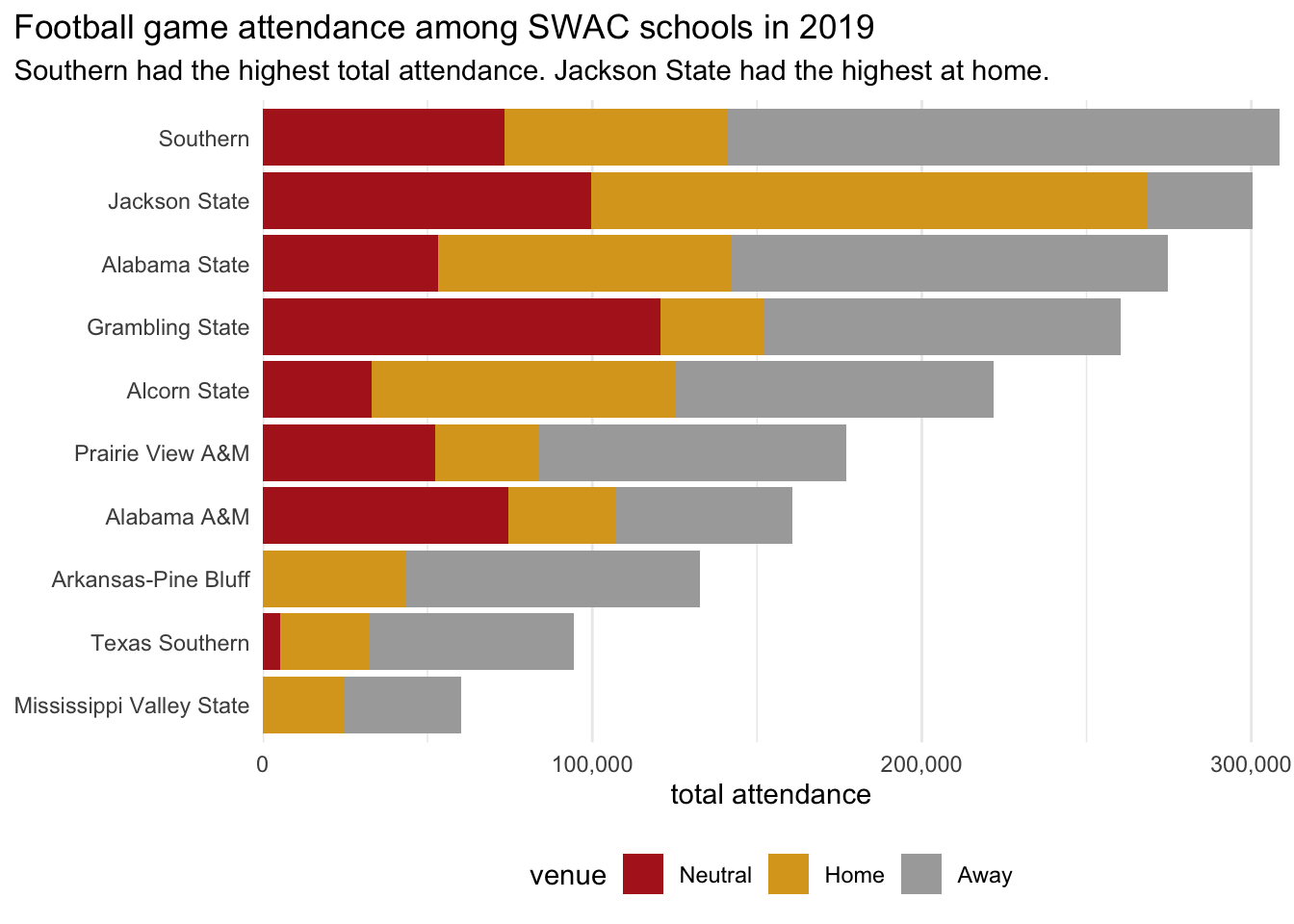
all_teams <- football |>
filter(season == 2019) |>
ggplot(
mapping = aes(
x = attendance,
y = reorder(team, attendance, sum, na.rm = TRUE))) +
geom_col(mapping = aes(fill = team_venue)) +
scale_x_continuous(
labels = comma,
expand = c(0,0)) +
labs(
title = "Football game attendance among SWAC schools in 2019",
subtitle = "Southern had the highest total attendance. Jackson State had the highest at home.",
x = "total attendance",
y = NULL,
fill = "venue") +
scale_fill_manual(
values = c(
Away = "darkgray",
Home = "goldenrod",
Neutral = "firebrick"),
guide = guide_legend(reverse = TRUE)) +
theme_minimal() +
theme(
legend.position = "bottom",
plot.title.position = "plot",
panel.grid.major.y = element_blank(),
panel.grid.minor.y = element_blank())
all_teams- 1
-
Setting
expansionto0reduces the margins between the axis labels and bars. - 2
- Reversing the order of items in the legend matches them with the order they’re shown in the figure. Keeping this order consistent helps make the legend easier to read.
- 3
- The title usually aligns with the edge of the panel, but sometimes we need more room.
- 4
- We don’t need Y-axis grid lines when bars already orient our eyes. Turning them off removes unnecessary information, which can help the reader focus on a figure’s more important details.
all_teams = (
football[football["season"] == 2019] >>
ggplot(
mapping = aes(
x = "reorder(team, attendance, np.sum)",
y = "attendance"))
+ geom_col(
mapping = aes(fill = "team_venue"))
+ labs(
title = "Football game attendance among SWAC schools in 2019",
subtitle = "Southern had the highest total attendance. Jackson State had the highest at home.",
x = "",
y = "total attendance",
fill = "venue")
+ p9.coord_flip()
+ p9.scale_y_continuous(
labels=ml.comma_format(),
expand = [0,0])
+ p9.scale_fill_manual(
values = {
"Away": "darkgray",
"Home": "goldenrod",
"Neutral": "firebrick"},
guide = p9.guide_legend(reverse = True))
+ p9.theme_minimal()
+ p9.theme(
legend_position = "bottom",
plot_title_position = "plot",
panel_grid_major_y = p9.element_blank(),
panel_grid_minor_y = p9.element_blank())
)
all_teams.show()- 1
-
Setting
expansionto0reduces the margins between the axis labels and bars. - 2
- Reversing the order of items in the legend matches them with the order they’re shown in the figure. Keeping this order consistent helps make the legend easier to read.
- 3
- The title usually aligns with the edge of the panel, but sometimes we need more room.
- 4
- We don’t need Y-axis grid lines when bars already orient our eyes. Turning them off removes unnecessary information, which can help the reader focus on a figure’s more important details.

Grouped bars
Bars can be unstacked by adding position = "dodge" inside geom_col(). In this case, the resulting figure is somewhat noisy—and inaccurate.
all_teams <- football |>
  filter(season == 2019) |>
  ggplot(
    mapping = aes(
      x = attendance,
      y = reorder(team, attendance, sum, na.rm = TRUE),
      fill = team_venue)) +
  geom_col(position = "dodge")

all_teams
all_teams = (
  football[football["season"] == 2019] >>
  ggplot(
    mapping = aes(
      x = "reorder(team, attendance, np.sum)",
      y = "attendance",
      fill = "team_venue"))
  + geom_col(position = "dodge")
  + p9.coord_flip()
)

all_teams.show()
What isn’t clear from this image is that each bar is only showing the highest-attended game in each group, with other games overlapping. Adding transparency with alpha makes this more apparent.
all_teams <- football |>
  filter(season == 2019) |>
  ggplot(
    mapping = aes(
      x = attendance,
      y = reorder(team, attendance, sum, na.rm = TRUE),
      fill = team_venue)) +
  geom_col(position = "dodge", alpha = 0.2, color = "gray")

all_teams
all_teams = (
  football[football["season"] == 2019] >>
  ggplot(
    mapping = aes(
      x = "reorder(team, attendance, np.sum)",
      y = "attendance",
      fill = "team_venue"))
  + geom_col(position = "dodge", alpha = 0.2, color = "gray")
  + p9.coord_flip()
)

all_teams.show()
We could fix this problem by summarizing the data before visualizing, but there’s an easier way.
Facets
Wrapped facets
Another way to prepare this same data is by using faceting to show small multiples. Like a grouped bar chart, this method juxtaposes venue types for easy comparison. Unlike the dodged bar chart, which aligns all the teams on a single vertical axis, faceting makes a miniature chart for each team. Here, facet_wrap() manages everything.
Code defining abbrev_num()
abbrev_num <- function(n) {
  case_when(
    n >= 10^6 ~ round(n/(10^6), 1) |> paste0("M"),
    n >= 10^3 ~ round(n/(10^3), 1) |> paste0("K"),
    .default = as.character(n)
  )
}
team_facets <- football |>
filter(season == 2019) |>
ggplot(
mapping = aes(
x = attendance,
y = team_venue,
fill = team_venue)) +
geom_col() +
facet_wrap("team") +
scale_x_continuous(labels = abbrev_num)
team_facets
Code defining abbrev_num()
def abbrev_num(number):
  result = []
  for n in number:
    if n >= 10**6:
      result.append(f"{n / (10**6):.0f}M")
    if n >= 10**3:
      result.append(f"{n / (10**3):.0f}K")
    else:
      result.append(f"{n:.0f}")
  return result
team_facets = (
football[football["season"] == 2019] >>
ggplot(
mapping = aes(
y = "attendance",
x = "team_venue",
fill = "team_venue"))
+ geom_col()
+ p9.coord_flip()
+ p9.facet_wrap("team")
+ p9.scale_y_continuous(labels = abbrev_num)
)
team_facets.show()
From here, it’s easy to refine things. We’ll tweak the theme, adopt the same color scheme we’ve been using, hide the unnecessary legend, and adjust grid lines, spacing, and labels.
team_facets +
  labs(
    title = "Football game attendance among SWAC schools in 2019",
    subtitle = "Jackson State had the highest at home. Grambling had the highest in neutral venues.",
    x = "total attendance",
    y = NULL) +
  scale_x_continuous(expand = c(0, 0), labels = abbrev_num) +
  scale_fill_manual(
    values = c(
      Away = "darkgray",
      Home = "goldenrod",
      Neutral = "firebrick"),
    guide = guide_legend(reverse = TRUE)) +
  theme_minimal() +
  theme(
    legend.position = "none",
    panel.grid.major.y = element_blank(),
    panel.grid.minor.x = element_blank())
team_facets = (
  team_facets
  + labs(
    title = "Football game attendance among SWAC schools in 2019",
    subtitle = "Jackson State had the highest at home. Grambling had the highest in neutral venues.",
    y = "total attendance",
    x = "")
  + p9.scale_y_continuous(expand = [0, 0], labels = abbrev_num)
  + p9.scale_fill_manual(
    values = {
      "Away" : "darkgray",
      "Home" : "goldenrod",
      "Neutral" : "firebrick"},
    guide = p9.guide_legend(reverse = True))
  + p9.theme_minimal()
  + p9.theme(
    legend_position = "none",
    panel_grid_major_y = p9.element_blank(),
    panel_grid_minor_x = p9.element_blank())
)

team_facets.show()
Facets on a grid
Wrapping facets is useful for showing lots of information at once, but direct comparisons across categories often fare better on a grid. By setting the cols and rows arguments inside facet_grid(), we can compare attendances at four universities in the years immediately before and after disruptions to the 2020 season.
before_and_after <- football |>
filter(
season %in% c(2018, 2019, 2021, 2022),
str_detect(team, "Jackson|Texas|Alabama")) |>
mutate(
twenty20 = if_else(season < 2020, "before", "after") |>
factor(levels = c("before", "after"))
) |>
ggplot() +
geom_col(aes(
x = attendance,
y = "1",
fill = team_venue)) +
facet_grid(
rows = vars(twenty20),
cols = vars(team),
scales = "free_x")
before_and_after- 1
-
When we define the
twenty20column we’re also explicitly defining the order we want to display the rows. If we don’t explicitly set the levels of this new factor, {ggplot2} will alphabetize the output. - 2
-
We want each row to have just a single value on the Y-axis, so we’re setting it to an arbitrary number
"1". We’ll hide evidence of this sneaky trick later. - 3
-
Setting
scales = "free_x"lets each column have its own scale on the X-axis. This setting makes it easier to compare each university’s attendance to itself.

Code defining add_2020_col()
def add_2020_col(df):
df = df.copy()
df["twenty20"] = np.where(df["season"] < 2020, "before", "after")
df["twenty20"] = pd.Categorical(df["twenty20"], categories=["before", "after"], ordered=True)
return df- 1
-
When we define the
twenty20column we’re also explicitly defining the order we want to display the rows. If we don’t explicitly set the levels of this new factor, {plotnine} will alphabetize the output.
before_and_after = (
football[
(football["season"].isin([2018, 2019, 2021, 2022])) &
(football["team"].str.contains("Jackson|Texas|Alabama"))
]
.pipe(add_2020_col) >>
ggplot(
mapping = aes(
y = "attendance",
x = "1",
fill = "team_venue"))
+ geom_col()
+ p9.coord_flip()
+ p9.facet_grid(
rows = "twenty20",
cols = "team",
scales = "free_x")
)
before_and_after.show()- 1
-
We want each row to have just a single value on its axis, so we’re setting it to an arbitrary number
"1". We’ll hide evidence of this sneaky trick later. - 2
-
Setting
scales = "free_x"lets each column have its own scale on the X-axis. This setting makes it easier to compare each university’s attendance to itself. (This is potentially confusing since we’re usingcoord_flip()!)

As always, we’ll want to polish things up for message and beauty. Among other things, it’s a good idea to adjust the figure height to be shorter than the default shown above.
before_and_after +
labs(
title = "Football game attendance two years before and after 2020",
subtitle = "Some SWAC universities saw shrinking crowds; others reached new audiences.",
fill = "venue",
x = "total attendance",
y = NULL) +
scale_x_continuous(labels = abbrev_num) +
scale_fill_manual(
values = c(
Away = "darkgray",
Home = "goldenrod",
Neutral = "firebrick"),
guide = guide_legend(reverse = TRUE)) +
theme_minimal() +
theme(
legend.position = "bottom",
panel.grid.major.y = element_blank(),
panel.grid.minor.x = element_blank(),
axis.text.y = element_blank(),
axis.ticks.y = element_blank())- 1
- Here we hide evidence of our sneaky Y-axis definition from earlier.

Note
In R, we can set the aspect ratio of a Quarto figure by defining fig-asp in the YAML parameters.
before_and_after = (
before_and_after
+ labs(
title = "Football game attendance two years before and after 2020",
subtitle = "Some SWAC universities saw shrinking crowds; others reached new audiences.",
fill = "venue",
y = "total attendance",
x = "")
+ p9.scale_y_continuous(labels = abbrev_num)
+ p9.scale_fill_manual(
values = {
"Away": "darkgray",
"Home": "goldenrod",
"Neutral": "firebrick"},
guide = p9.guide_legend(reverse = True))
+ p9.theme_minimal()
+ p9.theme(
legend_position = "bottom",
panel_grid_major_y = p9.element_blank(),
panel_grid_minor_x = p9.element_blank(),
axis_text_y = p9.element_blank(),
axis_ticks_y = p9.element_blank(),
figure_size = [6.5, 2.4])
)
before_and_after.show()- 1
-
Here we hide evidence of our sneaky X-axis definition from earlier. Again,
coord_flip()makes everything confusing. - 2
-
{plotnine}’s
figure_sizeparameter sets width and height in inches. This method differs from R and {ggplot2} in a Quarto document, in which we can setfig-aspusing YAML.

This example’s a little contrived, since we might just as easily define before and after on a vertical axis. Consider instead a scenario faceting on team and venue, with bars for before and after 2020.
Code visualizing with facet_grid()
venue_facet <- football |>
filter(
season %in% c(2018, 2019, 2021, 2022),
str_detect(team, "Jackson|Texas|Alabama")) |>
mutate(
twenty20 = if_else(season < 2020, "before", "after") |>
factor(levels = c("before", "after"))
) |>
ggplot() +
geom_col(aes(
x = attendance,
y = twenty20,
fill = twenty20)) +
facet_grid(
rows = vars(team_venue),
cols = vars(team),
scales = "free_x") +
labs(
title = "Football game attendance by venue two years before and after 2020",
subtitle = "Some SWAC universities saw shrinking crowds; others reached new audiences.",
x = "total attendance",
y = NULL) +
scale_fill_manual(
values = c(
before = "navy",
after = "darkcyan")) +
scale_y_discrete(limits = c("after", "before")) +
scale_x_continuous(
expand = expansion(mult = c(0, 0.05)),
labels = abbrev_num) +
theme_bw() +
theme(
legend.position = "none",
panel.grid.major.y = element_blank(),
panel.grid.minor.x = element_blank(),
panel.spacing = unit(0.4, "cm"))
venue_facet- 1
-
Values on a vertical axis are defined from the bottom to the top, so our categories were out of order. Setting the axis
limitslets us be explicit about ordering. - 2
-
The
expandargument expects two or four values for adding space at either end of the axes, andexpansion()makes these clear. Here, we’re removing any multiplicative margin at the lower level by setting it to 0, and we’re keeping the upper margin at 5%. - 3
-
Adjust [
panel.spacing], to keep X-axis values on neighboring facets from bumping into each other.

Code visualizing with facet_grid()
venue_facet = (
football[
(football["season"].isin([2018, 2019, 2021, 2022])) &
(football["team"].str.contains("Jackson|Texas|Alabama"))
]
.pipe(add_2020_col) >>
ggplot(
mapping = aes(
y = "attendance",
x = "twenty20",
fill = "twenty20"))
+ geom_col()
+ labs(
title = "Football game attendance by venue two years before and after 2020",
subtitle = "Some SWAC universities saw shrinking crowds; others reached new audiences.",
y = "total attendance",
x = "")
+ p9.coord_flip()
+ p9.facet_grid(
rows = "team_venue",
cols = "team",
scales = "free_x")
+ p9.scale_x_discrete(limits = ["after", "before"])
+ p9.scale_y_continuous(
expand = [0, 0, 0.05, 0],
labels = abbrev_num)
+ p9.scale_fill_manual(
values = {
"before" : "navy",
"after" : "darkcyan"})
+ p9.theme_bw()
+ p9.theme(
legend_position = "none",
panel_grid_major_y = p9.element_blank(),
panel_grid_minor_x = p9.element_blank(),
panel_spacing = 0.025)
)
venue_facet.show()- 1
-
Values on a vertical axis are defined from the bottom to the top, so our categories were out of order. Setting the axis
limitslets us be explicit about ordering. - 2
-
The
expandargument accepts either two or four values. Here, we’re zeroing out any margins except a multiplicative upper margin of 5%. - 3
-
Adjust
panel_spacing, to keep horizontal axis values on neighboring facets from bumping into each other.

Dot plots
Like bar plots, dot plots scale continuous values across one positional axis. Unlike with bar plots, values in a dot plot are less likely to be hidden by other values.
For dot plots, replace geom_col() with geom_point(). To show average values, rather than every value in a category, we’ll create group summaries before plotting.
football |>
  filter(season == 2019) |>
  summarize(
    attendance = mean(attendance, na.rm = TRUE),
    .by = c(team, team_venue)) |>
  ggplot(mapping = aes(
    x = attendance,
    y = reorder(team, attendance, max),
    shape = team_venue,
    color = team_venue)) +
  geom_point() +
  labs(
    title = "Average attendance at 2019 SWAC football games",
    subtitle = "Grambling's neutral-venue crowds dominated",
    x = "average attendance",
    y = NULL,
    color = NULL,
    shape = NULL) +
  scale_x_continuous(labels = comma) +
  theme_minimal() +
  theme(legend.position = "bottom")
(
  (football[football["season"] == 2019]
  .groupby(["team", "team_venue"], as_index=False)
  .agg(attendance=("attendance", "mean"))) >>
  ggplot(mapping = aes(
    x = "attendance",
    y = "reorder(team, attendance, np.nanmax)",
    shape = "team_venue",
    color = "team_venue"))
  + geom_point()
  + labs(
    title = "Average attendance at 2019 SWAC football games",
    subtitle = "Grambling's neutral-venue crowds dominated",
    x = "average attendance",
    y = "",
    color = "",
    shape = "")
  + p9.scale_x_continuous(labels = ml.comma_format())
  + p9.theme_minimal()
  + p9.theme(legend_position = "bottom")
).show()
Heatmaps
Where bar plots and dot plots scale continuous values positionally, heatmaps show them on a color gradient. Use geom_tile() instead of geom_col() or geom_point(), and map fill to a continuous value.
football |>
filter(season == 2019) |>
group_by(team, team_venue) |>
summarize(
attendance = mean(attendance, na.rm = TRUE)) |>
ggplot(mapping = aes(
x = team_venue,
y = reorder(team, attendance, max),
fill = attendance)) +
geom_tile() +
labs(
title = "Average attendance at 2019 SWAC football games by venue",
subtitle = "Grambling's neutral-venue crowds dominated",
x = NULL, y = NULL,
fill = "average\nattendance") +
scale_fill_viridis_c(labels = abbrev_num) +
scale_x_discrete(position = "top") +
theme_minimal() +
theme(
plot.title.position = "plot",
panel.grid = element_blank())- 1
-
Use
\nto indicate a line break in labels. - 2
-
A continuous viridis color palette works well for showing intensity because it incorporates variance in both brightness and hue. Just as with X- or Y-axis scales, the
labelsargument allows numbers to be formatted. - 3
-
Categorical heat maps often have X-axis labels at the top. Setting
position = "top"inscale_x_discrete()will get the job done.

from matplotlib.ticker import FuncFormatter
(
(football[football["season"] == 2019]
.groupby(["team", "team_venue"], as_index=False)
.agg(attendance=("attendance", "mean"))) >>
ggplot(mapping = aes(
x = "team_venue",
y = "reorder(team, attendance, np.nanmax)",
fill = "attendance"))
+ geom_tile()
+ labs(
title = "Average attendance at 2019 SWAC football games by venue",
subtitle = "Grambling's neutral-venue crowds dominated",
x = "", y = "",
fill = "average\nattendance")
+ p9.scale_fill_continuous(labels = abbrev_num)
+ p9.theme_minimal()
+ p9.theme(
plot_title_position = "plot",
panel_grid = p9.element_blank())
).show()- 1
-
Use
\nto indicate a line break in labels. - 2
-
{plotnine} uses the viridis color palette by default for continuous scales. Just as with X- or Y-axis scales, the
labelsargument allows numbers to be formatted.

Note
It’s common for categorical heatmaps to show X-axis labels at the top, but {plotnine} currently provides no way to reposition axes. See GitHub for this closed issue in 2018 or Stack Overflow for this answer by the developer in 2020.