library(tidyverse)
library(swac)

if (!file.exists("scorecard.rds")) {
  download.file("https://github.com/gadenbuie/scorecard-db/raw/refs/heads/main/data/tidy/scorecard.rds", "scorecard.rds")
}

if (!file.exists("school.rds")) {
  download.file("https://github.com/gadenbuie/scorecard-db/raw/refs/heads/main/data/tidy/school.rds", "school.rds")
}

scorecard <- readRDS("scorecard.rds")
school <- readRDS("school.rds")

higher_ed <- school |>
  left_join(scorecard) |>
  rename(funding = control) |>
  mutate(
    designation = if_else(is_hbcu, "HBCU", "not HBCU"),
    conference = if_else(id %in% universities$id, "SWAC", "other"),
    funding = funding |>
      tolower() |>
      str_replace_all("nonprofit", "private") |>
      str_replace_all("for-profit", "for profit") |>
      factor(levels = c("public", "private", "for profit"))
  )

higher_ed_18 <- higher_ed |>
  filter(academic_year == "2018-19")

write_csv(higher_ed, "data/higher_ed.csv")
write_csv(universities, "data/universities.csv")Parts of a Whole
with {ggplot2} and {plotnine}
R
Python
What portion of the Southwest Athletic Conference is funded publicly vs privately? Is it even close?
Getting to see the big picture is necessary to understand how pieces fit together. Visualizations focusing on proportions provide the kind of context needed to answer questions of proportionality. Waffle charts, pie charts, stacked bar charts, and stacked area charts, all discussed in chapter 10 of Claus Wilke’s Fundamentals of Data Visualization, are common methods to show simple proportions of one or more measurements. More complicated, nested proportionality is often depicted with mosaic plots or parallel sets as covered in Wilke’s chapter 11.
Putting these fundamentals into practice, here we’ll visualize data with code. We’ll start simply, charting the share of public versus private schools in the SWAC before digging deeper for new insights into funding in U.S. higher education. These code explanations will be prepared using the scorecard and schools data sets from {scorecard-db}, drawn from data originally collated by the U.S. Department of Education, along with the universities data set from {swac}.
Note
Coming soon: This page is currently being updated with standardized datasets and parallel Python examples.
Prepare datasets in R and Python
from plotnine import (
  ggplot, aes, labs,
  geom_col,
  geom_histogram, geom_density, geom_boxplot
)
import plotnine as p9
import pandas as pd

universities = pd.read_csv("data/universities.csv")
higher_ed = (
  pd.read_csv("data/higher_ed.csv")
  .assign(
    deg_predominant=lambda df: pd.Categorical(
      df["deg_predominant"],
      categories=["Certificate", "Associate", "Bachelor", "Graduate"],
      ordered=True),
    funding = lambda df: pd.Categorical(
      df["funding"],
      categories = ["public","private", "for profit"],
      ordered = True))
)
higher_ed_18 = higher_ed[higher_ed["academic_year"] == "2018-19"]
Simple Proportions
Waffle Chart
Waffle charts display proportions in colored blocks that are easy to understand. They’re also relatively easy to make. In the simplest version, each block is one instance of that category.
Thanks to additional packages in R and Python, preparing a waffle plot generally takes three steps:
- Prepare data by counting amounts in each category.
- Plot the data
- Try not to get hungry.
In R, combining {dplyr}’s filter() and pull() returns the values in the funding column. Then, because these values are factors, as.character() simplifies things to remove unused categories before table() returns the counts of each.
he_counts <- higher_ed_18 |>
  filter(conference == "SWAC") |>
  pull(funding) |>
  as.character() |>
  table()
After that, plotting is easy using waffle() from the {waffle} package:

In this usage, waffle() adds as many squares as necessary to make the visualization rectangular. Setting explicit colors will allow for blanks:

Advanced R syntax
Under the covers, waffle() prepares the kind of {ggplot2} figure that can be made with geom_waffle():
higher_ed_18 |>
  filter(conference == "SWAC") |>
  count(funding) |>
  ggplot(aes(fill = funding, values = n)) +
  geom_waffle()
Tweak this figure further with a combination of theme_void() and coord_equal().
In Python, combining .groupby() and .size() methods will return the number of rows in each grouping. Grouping returns a Series, but it can be converted into a dictionary with .to_dict():
he_waffle =  (
  higher_ed_18[higher_ed_18["conference"] == "SWAC"]
    .groupby("funding")
    .size()
    .to_dict()
)
Once groups are counted, the PyWaffle library helps prepare the figure:
import matplotlib.pyplot as plt
from pywaffle import Waffle

plt.figure(
  FigureClass = Waffle,
  rows = 3,
  values = he_waffle,
  legend = {'loc': 'upper center', 'bbox_to_anchor': (0.5, 0)}
)

plt.show()
It’s common to show each square of a waffle chart as a percentage point.
Convert values to percentages by dividing by the sum and multiplying by 100.

Adjusting rows and columns will keep the figure proportionate. Displaying 100 squares will show each square as 1%.
plt.figure(
  FigureClass = Waffle,
  rows = 10,
  columns = 10,
  values = he_waffle,
  legend = {'loc': 'upper center', 'bbox_to_anchor': (0.5, 0)}
)

plt.show()
Stacked Bar Chart
Stacked bar are similar to waffle charts, but they show continuous values rather than countable blocks. To stack a bar chart in ggplot, set the fill aesthetic to counted categories:

funding_counts = (
  higher_ed_18[higher_ed_18["conference"] == "SWAC"]
  .groupby(["conference", "funding"])
  .size()
  .reset_index(name = "n")
  .query('n > 0')
  .assign(funding=lambda df: df["funding"].cat.remove_unused_categories())
)

stacked_bar = (
  funding_counts >>
  ggplot(
    mapping = aes(
      x = "conference",
      y = "n",
      fill = "funding"))
  + geom_col(color = "white")
)

stacked_bar.show()
Note
{plotnine} uses a continuous viridis color palette for categorical data. Adding scale_color_discrete() will change the display back to the default palette.
The “public” category is obviously the biggest. Adding text labels with geom_text() will clear up any uncertainty. These labels can be centered with position = position_stack(vjust = 0.5).
stacked_bar <- stacked_bar +
  geom_text(aes(label = n),
            position = position_stack(vjust = 0.5),
            color = "white")

stacked_bar
stacked_bar = (
  stacked_bar
  + p9.geom_text(
    mapping = aes(label = "n"),
    position = p9.position_stack(vjust = 0.5),
    color = "white")
)

stacked_bar.show()
Finally, adjust the aesthetics for polish.
stacked_bar <- stacked_bar +
  scale_fill_brewer(palette = "Dark2") +
  labs(fill = NULL,
       title = "SWAC schools by funding") +
  theme_void() +
  theme(plot.title = element_text(hjust = 0.5))

stacked_bar
stacked_bar = (
  stacked_bar
  + p9.scale_fill_brewer(type = "qual", palette = "Dark2")
  + labs(fill = "", title = "SWAC schools by funding")
  + p9.theme_void()
  + p9.theme(plot_title = p9.element_text(hjust = 0.5))
)

stacked_bar.show()
Pie chart
Pie charts are another common way to show proportions. Comparing group sizes in a pie chart depends on comparing angles, which is not very intuitive, so pie charts are best suited to comparing smaller groups of categories.
From a stacked bar chart, it only takes a change in coordinate systems to make a pie chart. Here, theta = "y" tells coord_polar() that the old Y-axis should now be mapped to angle:
pie_chart <- stacked_bar +
  coord_polar(theta = "y")

pie_chart
Circular charts are often read clockwise from the top, so the legend items should match that order:
pie_chart <- pie_chart +
  scale_fill_brewer(palette = "Dark2",
                    guide = guide_legend(reverse = TRUE))

pie_chart
Since {plotnine} doesn’t yet support polar coordinates, Python’s pie charts are a little harder to bake. Instead, use {matplotlib}’s pie() function directly:
plt.cla()

plt.pie(funding_counts["n"], labels = funding_counts["funding"], autopct='%1.1f%%', startangle=90);
Comparing proportions
Stacked Bar Charts
It’s common to set bars beside each other to compare proportions across categories—for instance, to compare the portions of students attending public or private schools based on each school’s predominant degree level.
school_type_funding <-
  higher_ed |>
  drop_na(funding, deg_predominant) |>
  filter(academic_year == last(academic_year)) |>
  count(funding, deg_predominant)

school_type_funding |>
  ggplot(
    mapping = aes(
      x = deg_predominant,
      y = n,
      fill = funding)) +
  geom_col() +
  scale_y_continuous(labels = scales::comma)
import mizani.labels as ml

school_type_funding = (
  higher_ed
  .dropna(subset=['funding', 'deg_predominant'])
  .query('academic_year == "2022-23"')
  .value_counts(["funding", "deg_predominant"])
  .reset_index(name="n")
)

(school_type_funding >>
  ggplot(
    aes(
      x = 'deg_predominant',
      y = 'n',
      fill = 'funding'))
    + geom_col()
    + p9.scale_y_continuous(labels = ml.comma_format())
).show()
To simplify comparisons across groups, it’s often helpful to convert counts to percentages:
school_type_funding_pct <- school_type_funding |>
  group_by(deg_predominant) |>
  mutate(pct = n / sum(n, na.rm = TRUE))

multiple_percents <-  school_type_funding_pct |>
  ggplot(
    mapping = aes(
      x = deg_predominant,
      y = pct,
      fill = funding)) +
  geom_col() +
  scale_y_continuous(labels = scales::percent)

multiple_percents
school_type_funding_pct = (
  school_type_funding
  .groupby('deg_predominant')
  .apply(lambda df: df.assign(pct=df["n"] / df["n"].sum()))
  .reset_index(drop=True)
)

multiple_percents = (
  school_type_funding_pct >>
  ggplot(
    mapping = aes(
      x = 'deg_predominant',
      y = 'pct',
      fill = 'funding'))
  + geom_col()
  + p9.scale_y_continuous(labels = ml.percent_format())
)

multiple_percents.show()
As before, we end with polish:
multiple_percents <- multiple_percents +
  scale_fill_brewer(palette = "Dark2") +
  scale_y_continuous(
    labels = scales::label_percent(),
    expand = expansion(0)) +
  labs(
    fill = NULL,
    x = NULL,
    title = "Schools by funding and predominant degree",
    subtitle = "Schools that primarily offer certificates tend to operate for profit, \nwhile those that are mainly graduate schools tend to be nonprofit.",
    y = NULL) +
  theme_minimal() +
  theme(
    panel.grid.major.x = element_blank(),
    panel.grid.minor.x = element_blank())

multiple_percents
multiple_percents = (
  multiple_percents
  + p9.scale_fill_brewer(type = "qual", palette = "Dark2")
  + p9.scale_y_continuous(
    labels = ml.percent_format(),
    expand = [0,0])
  + labs(
    fill = "",
    x = "",
    title = "Schools by funding and predominant degree",
    subtitle = "Schools that primarily offer certificates tend to operate for profit, \nwhile those that are mainly graduate schools tend to be nonprofit.",
    y = "")
  + p9.theme_minimal()
  + p9.theme(
    panel_grid_major_x = p9.element_blank(),
    panel_grid_minor_x = p9.element_blank())
)

multiple_percents.show()
Pie charts
It’s a small step from multiple bars to multiple pies, but tweaks will still be necessary. The first step is probably to add faceting:
square_pies <- multiple_percents +
  facet_wrap(
    facets = vars(deg_predominant),
    scales = "free_x") +
  theme_void()

square_pies
square_pies = (multiple_percents
  + p9.facet_wrap(
    facets = "deg_predominant",
    scales = "free_x")
  + p9.theme_void()
)

square_pies.show()
Then it’s simply a matter of converting to polar coordinates where possible.
While converting to polar coordinates, we’ll also reverse the legend to match the order of categories clockwise from noon.
round_pies <- square_pies +
  coord_polar(theta = "y") +
  scale_fill_brewer(
    palette = "Dark2",
    guide = guide_legend(reverse = TRUE))

round_pies
Important
It’s not yet possible to make this conversion to polar coordinates with {plotnine}.
square_pies.show()
Stacked area
A stacked area chart looks similar to the stacked bar chart, but the X-axis is better suited for a continuous variable like time. A first pass of stacked area might work with absolute numbers to see how different categories contribute to a whole:
msi_spending <-
  higher_ed |>
  drop_na(funding, n_undergrads, cost_avg, is_hbcu, is_pbi, is_annhi, is_tribal, is_aanapii, is_hsi, is_nanti) |>
  mutate(
    year = academic_year |>
      substr(1, 4) |>
      as.integer(),
    spent = cost_avg * n_undergrads,
    designation = if_else(
      is_hbcu | is_pbi | is_annhi | is_tribal | is_aanapii | is_hsi | is_nanti,
      "MSI",
      "PWI"
    )) |>
  group_by(year, designation) |>
  summarize(
    spent = sum(spent)) |>
  ungroup()

stacked_area <- msi_spending |>
  ggplot(
    aes(
      x = year,
      y = spent,
      fill = designation)) +
  geom_area()

stacked_area
import numpy as np

msi_flags = ["is_hbcu", "is_pbi", "is_annhi", "is_tribal", "is_aanapii", "is_hsi", "is_nanti"]

msi_spending = (
  higher_ed
  .dropna(subset = ["funding", "n_undergrads", "cost_avg", *msi_flags])
  .assign(
    year=lambda df: df["academic_year"].str.slice(0, 4).astype("int64"),
    spent = lambda df: df["cost_avg"] * df["n_undergrads"],
    designation=lambda df: np.where(df[msi_flags].any(axis=1), "MSI", "PWI"))
  .groupby(["year", "designation"], as_index=False)
  .agg(spent=("spent", "sum"))
)

stacked_area = (
  msi_spending >>
  ggplot(
    aes(
      x = "year",
      y = "spent",
      fill = "designation"))
  + p9.geom_area()
)

stacked_area.show()
It’s hard to see trends this way, though, since both numbers move over time. Instead, convert numbers to percentage:

msi_spending_pct = (
  msi_spending
  .groupby("year")
  .apply(lambda df: df.assign(
    spent_pct = df["spent"] / df["spent"].sum()))
  .reset_index(drop = True)
  .assign(
    designation=lambda df: pd.Categorical(
      df["designation"],
      categories=df["designation"].unique()[::-1],
      ordered=True))
)

stacked_area_pct = (
  msi_spending_pct >>
  ggplot(
    aes(
      x = "year",
      y = "spent_pct",
      fill = "designation"))
  + p9.geom_area(color = "white")
  + p9.scale_fill_discrete()
)

stacked_area_pct.show()
Final touches can add polish and clarify the message:
stacked_area_pct +
  scale_y_continuous(
    breaks = c(
      msi_spending_pct |>
        filter(
          year == first(year),
          designation == "MSI") |>
        pull(spent_pct)
      ),
    labels = scales::label_percent(),
    expand = expansion(c(0,0)),
    sec.axis = dup_axis(
      name = NULL,
      breaks = c(
        msi_spending_pct |>
          filter(
            year == last(year),
            designation == "MSI") |>
          pull(spent_pct)),
      labels = scales::percent)
    ) +
  scale_x_continuous(
    expand = expansion(c(0,0))) +
  scale_fill_brewer(palette = "Dark2") +
  labs(
    fill = NULL,
    y = NULL,
    x = NULL,
    title = "Total Student Costs for Higher Education, 2009-2022"
    ) +
  annotate("text",
    label = "Predominantly white institutions' share of student spending grew.",
    color = "white",
    size = 5,
    x = 2015.5,
    y = 0.6,
    hjust = 0.5
  ) +
  annotate("text",
    label = "Minority-serving institutions attracted a falling share of all costs.",
    color = "white",
    size = 5,
    x = 2015.5,
    y = 0.15,
    hjust = 0.5
  ) +
  theme(
    legend.position = "none",
    plot.title = element_text(hjust = 0.5))
axis_values_2009 = msi_spending_pct.query("year == 2009 & designation == 'MSI'")["spent_pct"]

axis_values_2022 = msi_spending_pct.query("year == 2022 & designation == 'MSI'")["spent_pct"]

(stacked_area_pct
  + p9.scale_y_continuous(
    breaks = axis_values_2009,
    labels = ml.percent_format(),
    expand = [0,0]
    # sec_axis = p9.dup_axis(
    #   name = "",
    #   breaks = axis_values_2022,
    #   labels = ml.percent_format())
      )
  + p9.scale_x_continuous(
    expand = [0,0,0,0.5])
  + p9.scale_fill_brewer(type = "qual", palette = "Dark2")
  + labs(
    fill = "",
    y = "",
    x = "",
    title = "Total Student Costs for Higher Education, 2009-2022")
  + p9.annotate("text",
    label = "Predominantly white institutions' share of student spending grew.",
    color = "white",
    size = 10,
    x = 2015.5,
    y = 0.6,
    # hjust = 0.5
    )
  + p9.annotate("text",
    label = "Minority-serving institutions attracted a falling share of all costs.",
    color = "white",
    size = 10,
    x = 2015.5,
    y = 0.15,
    # hjust = 0.5
    )
  + p9.annotate("text",
    label = "27%",
    color = "#444444",
    size = 8,
    x = 2022.35,
    y = axis_values_2022,
    # hjust = 0.5
    )
  + p9.theme_minimal()
  + p9.theme(
    panel_grid_major_y = p9.element_blank(),
  )
  + p9.theme(
    legend_position = "none",
    plot_title = p9.element_text(hjust = 0.5))
).show()
Nested proportions
When showing detailed proportions of subgroups, it’s nice to put them in context of the larger groupings. Mosaic plots and parallel sets show this proportionality across multiple groupings.
Mosaic plots
Mosaic plots allow for comparison of proportions across two axes, showing values in the width of each. Pie charts might let us see that Grambling’s football team played away more often than at home, and that it won more often than it lost. But a mosaic plot also makes apparent the proportions shared across groups, showing that Grambling won more often at home and lost most often while away. In the figure below, a simple proportion can be read across the X axis: more games were won than lost because the “Loss” column on the X-axis is narrower than the “Win” column. Within columns, we can read the proportion of home and away games.
library(ggmosaic)

schools_mosaic <- scorecard |>
  filter(academic_year == last(academic_year)) |>
  left_join(school) |>
  rename(funding = control) |>
  mutate(
    designation = if_else(
      is_hbcu | is_pbi | is_annhi | is_tribal | is_aanapii | is_hsi | is_nanti,
      "Minority-serving",
      "Predominantly white"
    )
  )

schools_mosaic |>
  drop_na(funding, designation) |>
  ggplot() +
  geom_mosaic(
    aes(x = product(designation, funding), fill = funding),
    inherit.aes = TRUE,
    show.legend = FALSE) +
  theme_minimal() +
  labs(
    # x = NULL, # Axis labels don't work with ggmosaic.
    # y = NULL, # Instead, use element_blank() in theme().
    title = "Higher education funding by designation",subtitle = "Minority-serving schools are likelier to be public, less likelier to operate for profit.") +
  theme(
    axis.title.x = element_blank(),
    axis.title.y = element_blank(),
    panel.grid = element_blank())
schools_mosaic
Note
Use product() to define variables used inside geom_mosaic(). While this method works for the ggmosaic package, it also breaks the use of labs() to change axis labels. Instead, they’ve been rendered blank with theme().
from statsmodels.graphics.mosaicplot import mosaic

# msi_flags = ["is_hbcu", "is_pbi", "is_annhi", "is_tribal", "is_aanapii", "is_hsi", "is_nanti"]

schools_mosaic = (
  higher_ed[higher_ed['academic_year'] == "2022-23"]
  .assign(
    designation=lambda df: np.where(df[msi_flags].any(axis=1), "Minority-serving", "Predominantly white"))
  .groupby(["funding", "designation"], observed=True)
  .size()
  .to_dict()
)

schools_mosaic
{('public', 'Minority-serving'): 600, ('public', 'Predominantly white'): 1448, ('private', 'Minority-serving'): 280, ('private', 'Predominantly white'): 1630, ('for profit', 'Predominantly white'): 2423}mosaic(schools_mosaic, title='Higher education funding by designation')
schools_mosaic{('public', 'Minority-serving'): 600, ('public', 'Predominantly white'): 1448, ('private', 'Minority-serving'): 280, ('private', 'Predominantly white'): 1630, ('for profit', 'Predominantly white'): 2423}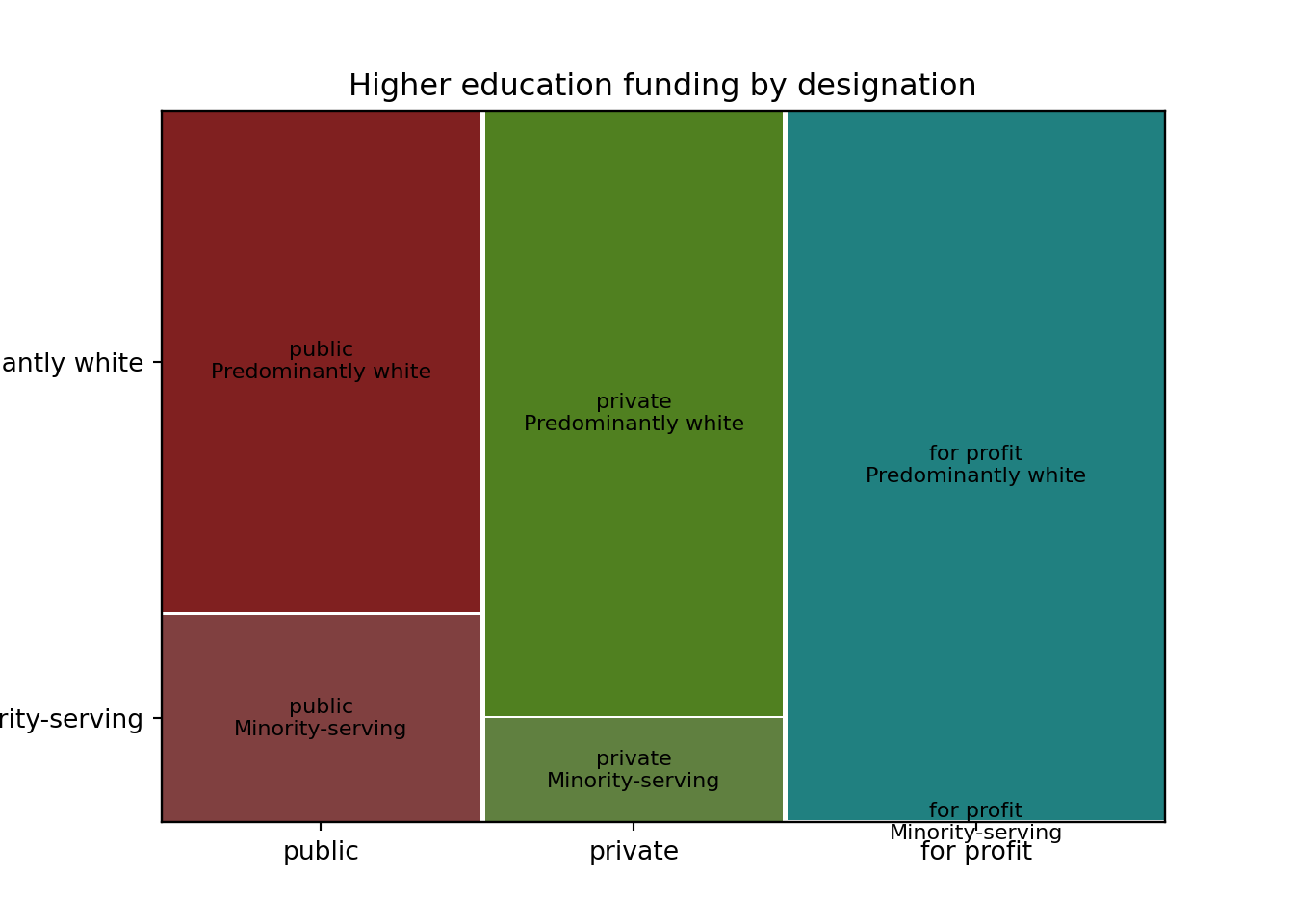
Parallel Sets
Parallel sets offer another way to show the relationship of multiple categories. With just two categories, they don’t differ greatly from what a mosaic plot might show, allowing for understanding of amount in each category and also showing proportions shared among groups.
To create a parallel set with ggforce, first use gather_set_data() on a data set of counts:
library(ggforce)

funding_designation_counts <- scorecard |>
  filter(academic_year == last(academic_year)) |>
  left_join(school) |>
  rename(funding = control) |>
  mutate(
    funding = funding |>
      str_remove_all("[(]nonprofit[)]") |>
      str_replace_all("Private [(]for profit[)]", "For Profit") |>
      fct_rev(),
    designation = if_else(
      is_hbcu | is_pbi | is_annhi | is_tribal | is_aanapii | is_hsi | is_nanti,
      "MSI",
      "Predominantly White"
    ) |>
      factor()
      ) |>
  count(academic_year, funding, designation) |>
  drop_na(funding, designation)

results_parallel <- funding_designation_counts |>
  select(-academic_year) |>
  gather_set_data(1:2)

results_parallel
When the data set is ready, use geom_parallel_sets() to draw the lines, geom_parallel_sets_axes() to draw the proportional axes, and geom_parallel_sets_labels() to label them. The resulting figure is usable with default values:
results_parallel |>
  ggplot(aes(x, id = id, split = y, value = n)) +
  geom_parallel_sets(aes(fill = funding)) +
  geom_parallel_sets_axes() +
  geom_parallel_sets_labels() +
  theme_void()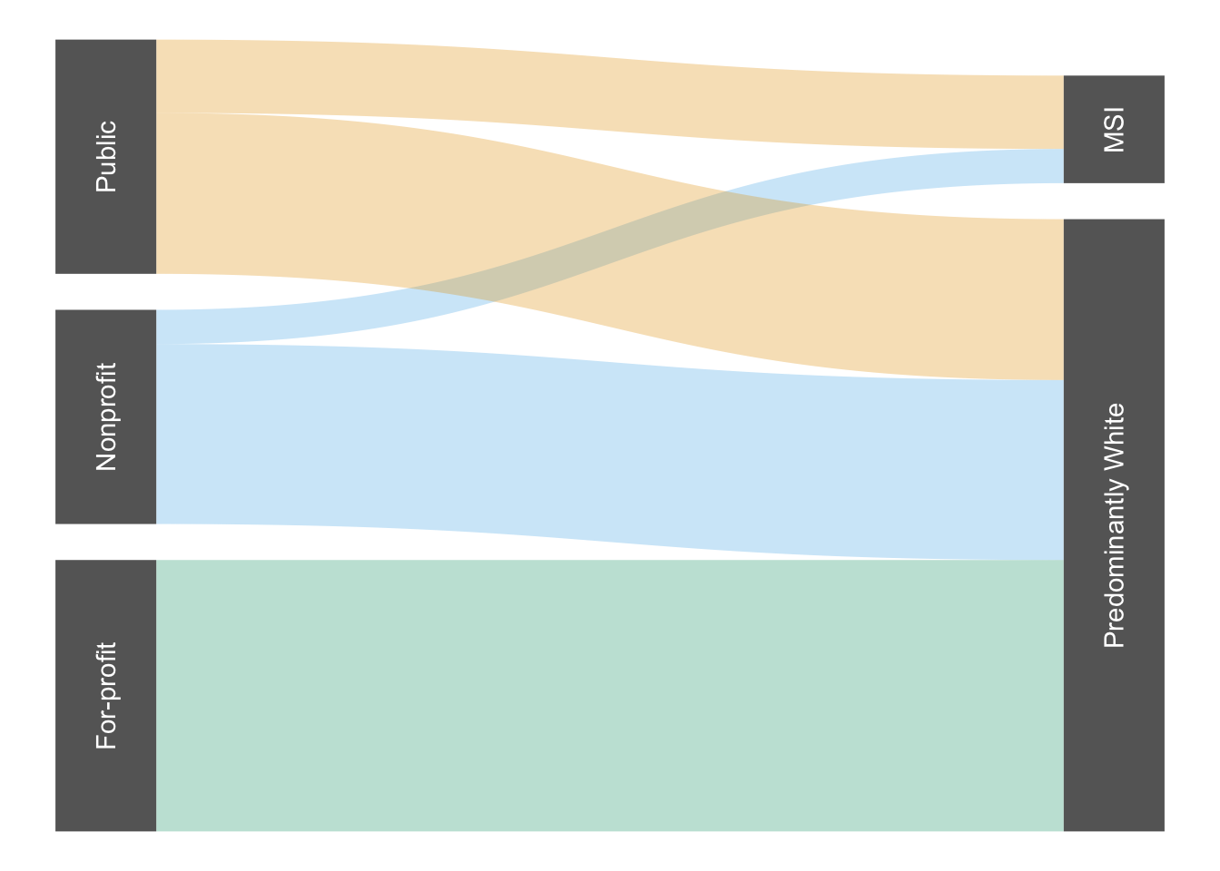
We’ll be happier after tweaks for a final polish:
results_parallel |>
  ggplot(aes(x, id = id, split = y, value = n)) +
  geom_parallel_sets(
    aes(fill = funding),
    alpha = 0.3, axis.width = 0.1,
    show.legend = FALSE) +
  geom_parallel_sets_axes(
    fill = "#666",
    axis.width = 0.1) +
  geom_parallel_sets_labels(
    colour = "white",
    angle = 90) +
  theme_void() +
  ggokabeito::scale_fill_okabe_ito() #+
# labs(title = "Grambling typically wins home games.")More complex data sets with overlapping lines can be harder to interpret:
titanic_counts <- titanic |>
count(Class, Sex, Age, Survived) |>
mutate(Survived = fct_recode(Survived,
Survived = "Yes",
Deceased = "No"))
titanic_counts |>
gather_set_data(1:4) |>
ggplot(aes(x, id = id, split = y, value = n)) +
geom_parallel_sets(aes(fill = Class),
alpha = 0.3, axis.width = 0.1,
show.legend = FALSE) +
geom_parallel_sets_axes(fill = "gray", color = "white", axis.width = 0.12) +
geom_parallel_sets_labels(colour = "black", angle = 90) +
theme_void() +
ggokabeito::scale_fill_okabe_ito() +
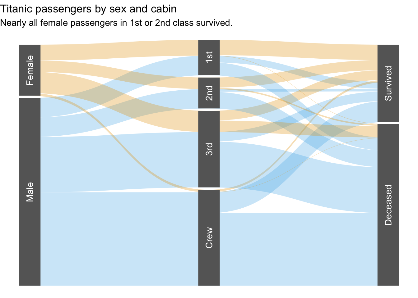
labs(title = "First-class passengers disproportionately survived the Titanic's sinking.")
Care must be taken to establish clarity when visualizing parallel sets. Because the first set of categories determines colors used throughout the chart, it should steer the takeaway message. At the same time, unneeded categories should be dropped and others reordered to minimize crossing lines.
titanic_counts |>
  # drop unneeded category
  select(-Age) |>
  # reorder existing categories
  relocate(Sex, Class, Survived) |>
  # reorder values within categories to limit crossing
  mutate(
    Sex = Sex |>
      factor(levels = c("Female", "Male")),
    Survived = Survived |>
      factor(levels = c("Survived", "Deceased"))) |>
  # prepare parallel sets
  gather_set_data(1:3) |>
  ggplot(aes(x, id = id, split = y, value = n)) +
  # draw lines
  geom_parallel_sets(
    aes(fill = Sex),
    alpha = 0.3,
    show.legend = FALSE,
    sep = 0.01) +
  # draw axes
  geom_parallel_sets_axes(
    fill = "#666",
    axis.width = 0.12,
    sep = 0.01) +
  # label the axes
  geom_parallel_sets_labels(
    colour = "white",
    angle = 90,
    sep = 0.01) +
  theme_void() +
  ggokabeito::scale_fill_okabe_ito() +
  labs(
    title = "Titanic passengers by sex and cabin",
    subtitle = "Nearly all female passengers in 1st or 2nd class survived.")