In {ggplot2} and {plotnine}, color is mapped two different ways:
color applies to points, lines, and edges.
fill applies to areas, shapes, and inside bars.
When choosing colors, keep in mind that functions like scale_color_manual() only apply to the first of these, while functions like scale_fill_manual() only apply to the second. In every case, the _fill_ or _color_ part of a function will indicate its target.
For different kinds of data—discrete, continuous, and binned—this page explains multiple methods for visualizing colors with using built-in functions. Other options are available through additional packages, but these are included with {ggplot2} and {plotnine}.
1 For manual palettes, define a vector of colors using the values argument. Set gradient colors in the high and low (and optionally mid) arguments. Colors can be chosen from a list of named colors or defined with a hex code
2 For Brewer palettes, choose a numbered or named set with the palette argument.
3 For Viridis palettes, choose a lettered or named set with the option argument.
Functions used for choosing colors for each type of data. Get comfortable with one of these rows, using either manual palettes, Brewer palettes, or Viridis palettes. For all functions, _color_ can be replaced with _fill_ to change which mapping it affects.
discrete data
numeric data
continuous
binned
manual1
scale_color_manual()
scale_color_gradient() or scale_color_gradient2()
—†
Brewer2
scale_color_brewer()
scale_color_distiller()
—
Matplotlib3
scale_color_cmap_d()
scale_color_cmap()
—
1 For manual palettes, define a vector of colors using the values argument. Set gradient colors in the high and low (and optionally mid) arguments. Colors can be chosen from a list of named colors or defined with a hex code
2 For Brewer palettes, choose a numbered or named set with the palette argument.
3 For Matplotlib palettes, choose a named palette with the cmap_name argument.
Functions used for choosing colors for each type of data. Get comfortable with one of these rows, using either manual palettes, Brewer palettes, or Matplotlib palettes. For all functions, _color_ can be replaced with _fill_ to change which mapping it affects.
Manual colors
Color names like “pink” and “orange” work with manual palettes in both R and Python, as do specific hues like “forestgreen” and “steelblue.” A full list of named colors for {ggplot2} can be viewed in the “Colors in R” cheat sheet, while the much larger list of named colors for {plotnine} can be seen in the “List of named colors” from {matplotlib}.
In addition to named colors, we can define colors as “hex codes” using hexadecimal notation.1 The first two digits of a hex code describe how red a color is from 0 to 255; the middle two describe how green it is; and the last two describe how blue. The following chart offers a sampling of hex codes and their colors.2
Combinations of six-digit hex codes can be used to define colors, with more than 16 million combinations. Try different values to get the color you want, or go with an online color picker to speed things up.
Brewer palettes
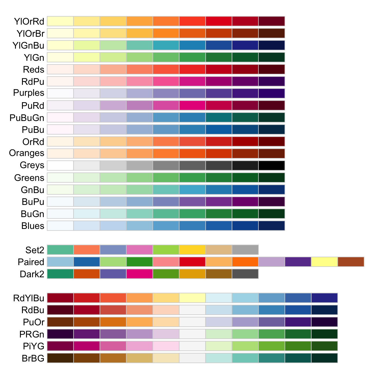
If you’d rather not pick colors manually, Brewer palettes offer palettes that work in many scenarios. You can choose from the full list or from one of the following palettes suited for varying abilities to see color:
These Brewer palettes are well suited for considerations of accessibility. They are shown here in groups of sequential, discrete, and diverging palettes.
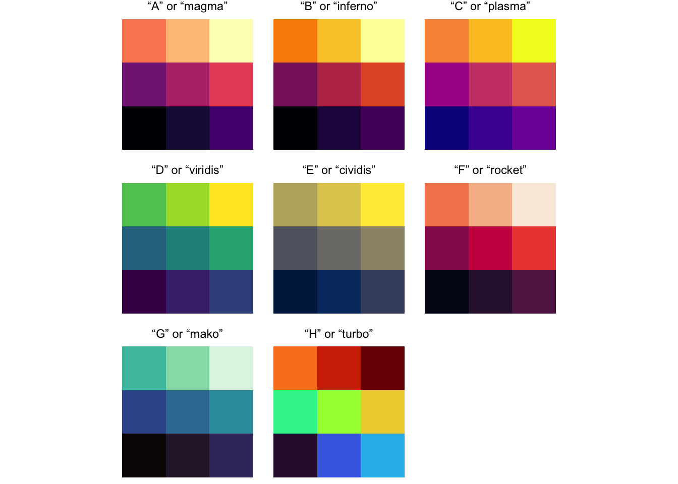
Viridis palettes offer another set of choices for colors in your visualizations. These palettes not only look beautiful on the screen, but they typically work well for print and are designed to accommodate most color vision needs. When using the related _viridis functions, change option to anything from “A” to “H” to try out different color choices, or use one of the named equivalents shown below. Option “H” or “turbo” could work for divergent scales or discrete scales, but it also has a few caveats: among them, it’s poorly suited for black and white printing since it doesn’t follow a linear path between dark and light. In addition to choosing the palette with option, try toggling direction between -1 and 1 to adjust the order of colors to work well with the data you’re showing.
Nine Viridis palettes are offered with {ggplot2}. Set one of your choosing using the option argument in the color scale function.
The Matplotlib palettes offer many palettes for use in visualizations. Many of these palettes not only look good on the screen, but they also work well for print and are designed to accommodate most color vision needs. When using the related _cmap functions, change cmap_name to a number to try out different color choices, or use one of the defined names. In addition to choosing the palette with cmap_name, try toggling direction between -1 and 1 to adjust the order of colors to work well with the data you’re showing.
The examples below show just a sample of all of the palettes available from Matplotlib:
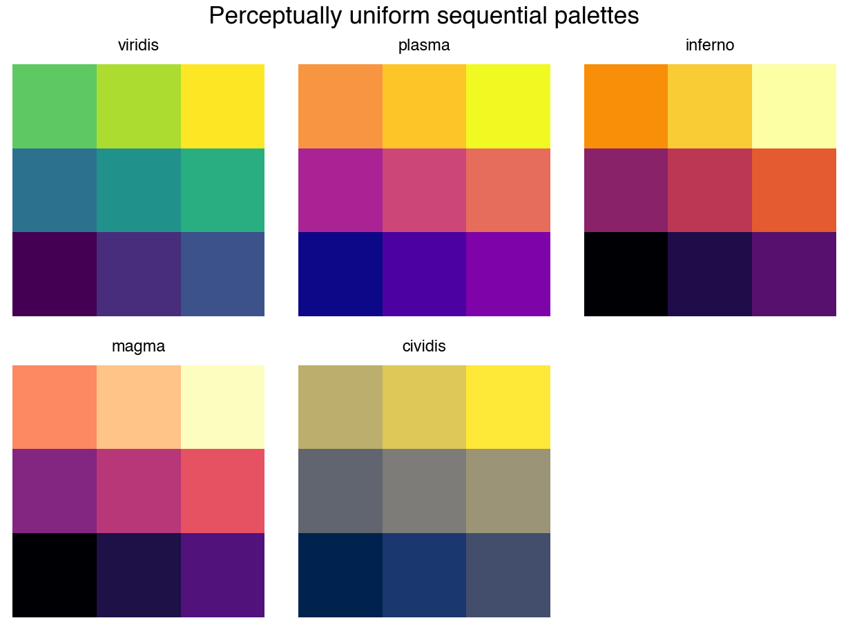
These sequential palettes are ideal for showing intensity. Many of Brewer’s sequential palettes are also available for use with scale_color_cmap(), but some other named palettes may also be chosen.
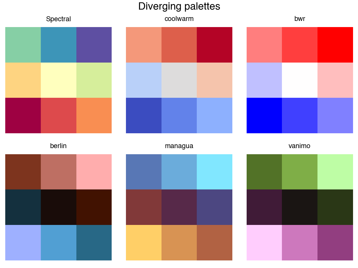
These diverging palettes are ideal for showing offset above or below a midpoint. Most of the Brewer diverging palettes are also available for use with the cmap_name argument in scale_color_cmap().
These qualitative palettes are ideal for differentiating categories. While the options shown here map to the default color palette of Tableau, most of the Brewer qualitative palettes are also available for use with scale_color_cmap_d(). Set one of your choosing using the cmap_name argument.
Whether choosing among colors manually or picking an already-assembled palette, these are just some of the options available for choosing colors with {ggplot2} and {plotnine}. Below, they’re shown in use with discrete, continuous, and binned data.
Examples
Data for examples on this page are prepared using data from the states() function in the tigris package and the universities, stadiums, and vollebyall data sets from the swac package.
R code preparing charts
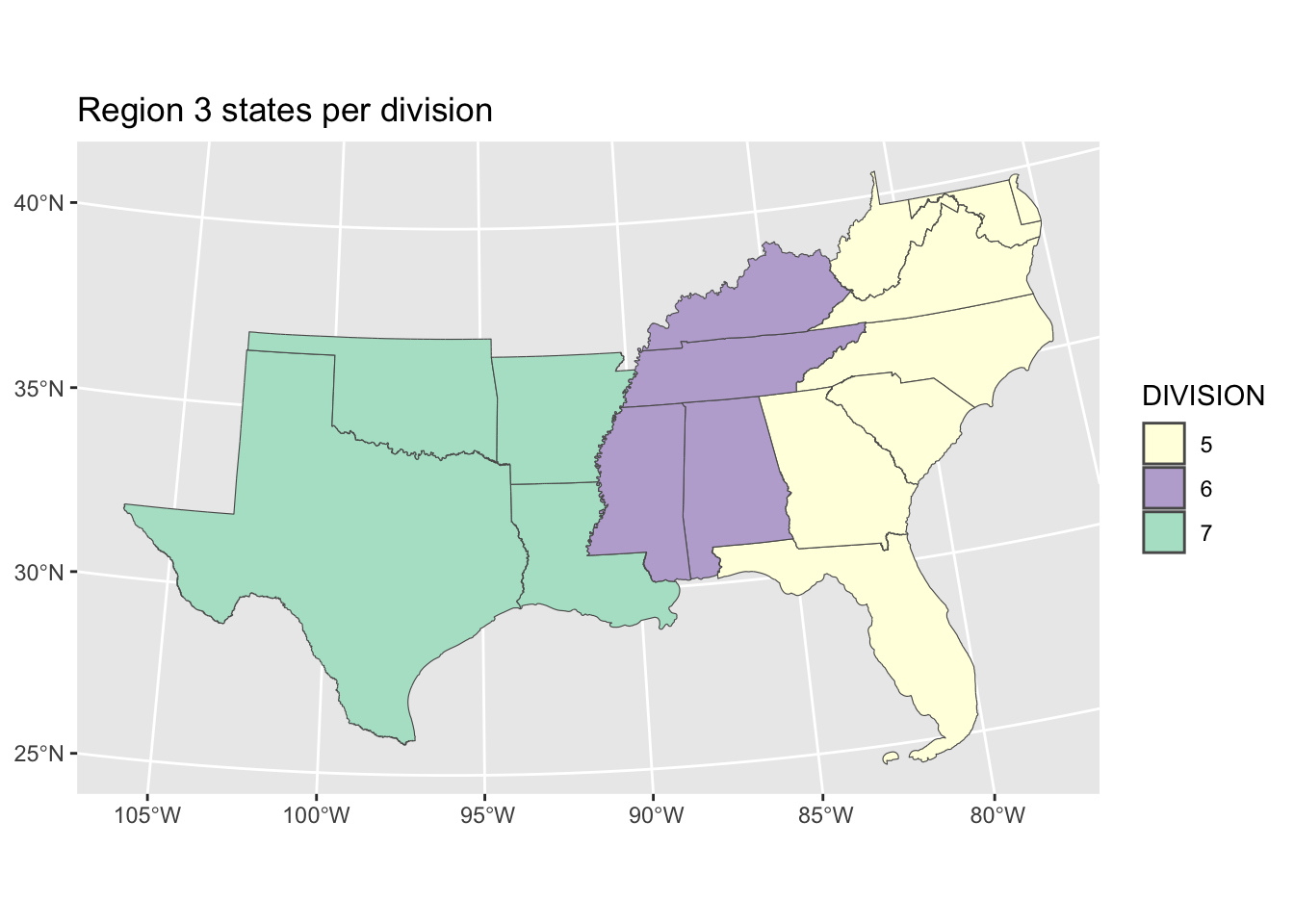
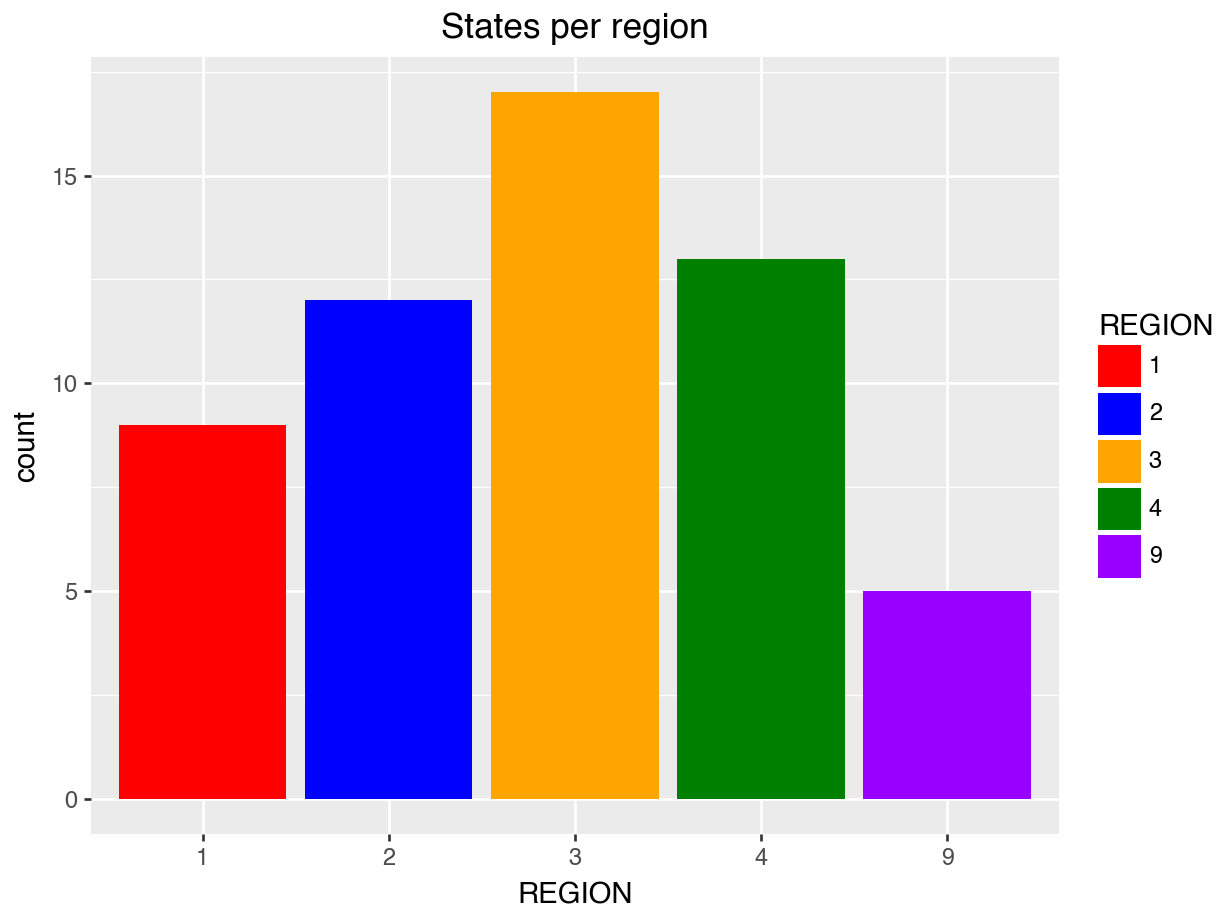
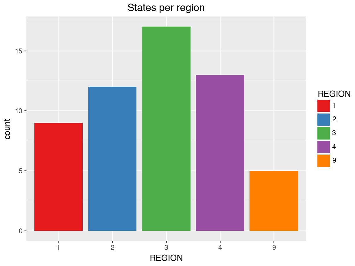
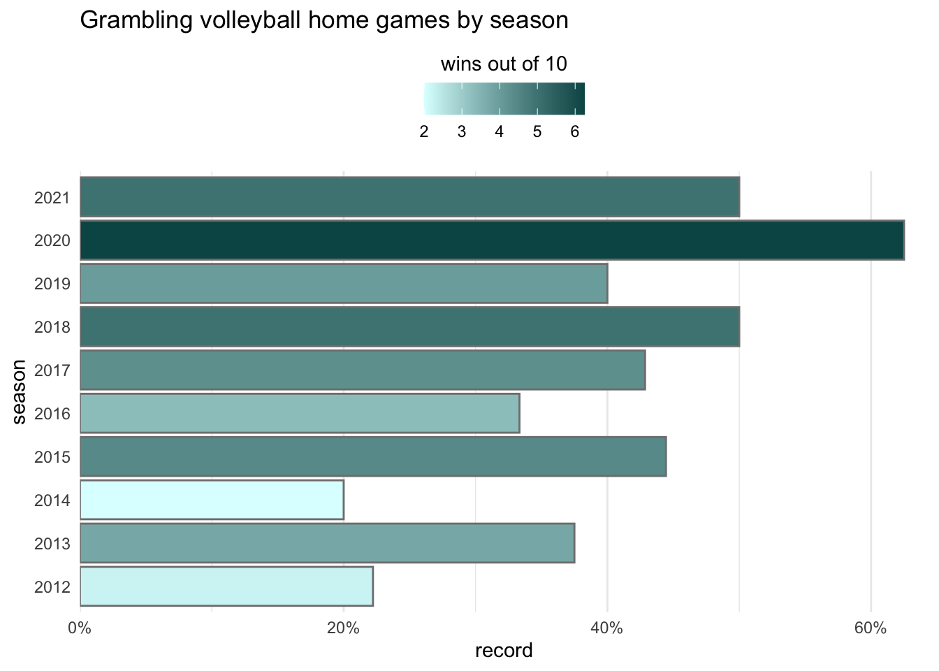
# Necessary packageslibrary(swac)library(tigris)library(sf)# Data objects for use laterus_states<-states(progress_bar =FALSE)map_swac<-right_join(us_states|>rename(state =STUSPS), universities, by ="state")stadium_sf<-left_join(football, stadiums, by ="stadium")|>left_join(universities|>select(team =name,state)|>mutate(team =team|>str_remove_all(" University.*$")|>str_replace_all("A & M|Agricultural and Mechanical","A&M")|>str_replace_all("University of Arkansas at Pine Bluff", "Arkansas-Pine Bluff")), by ="team")|>filter(!str_detect(stadium, "Laramie"))|>drop_na(lat)|>filter(team_venue=="Home")|>select(date, stadium, state, lat, lon)|>distinct()|>count(stadium, state, lat, lon)|>st_as_sf(coords =c("lon", "lat"), crs =4326)|>st_transform(crs =4269)gram_volleyball<-volleyball|>filter(team=="Grambling State", team_venue=="Home",season!=2022)|>summarize( record =mean(team_result>opponent_result, na.rm =TRUE), .by =season)# Plot objects to be reused in examplesstates_in_region3_fill<-us_states|>filter(REGION==3)|>ggplot()+geom_sf(aes(fill =DIVISION))+labs(title ="Region 3 states per division")+coord_sf(crs =st_crs(5070))states_in_region3_color<-us_states|>filter(REGION==3)|>ggplot()+geom_sf(aes(color =DIVISION))+labs(title ="Region 3 states per division")+coord_sf(crs =st_crs(5070))states_by_school_nums<-map_swac|>count(state, geometry)|>ggplot()+geom_sf(aes(fill =n))+labs(title ="SWAC member institutions per state")+coord_sf(crs =st_crs(5070))regions_by_number_fill<-us_states|>ggplot(aes(x =REGION, fill =REGION))+geom_bar()+labs(title ="States per region")regions_by_number_color<-us_states|>ggplot(aes(x =REGION, color =REGION))+geom_bar()+labs(title ="States per region")stadium_map_numeric<-us_states|>filter(REGION%in%c(3))|>ggplot()+geom_sf(color ="gray", fill ="white")+geom_sf(data =stadium_sf,aes(shape =n, color =n), size =3)+theme_void()+scale_shape_binned(solid =FALSE)+guides(# color = guide_legend(reverse = TRUE,# limits = c(0, 41), breaks = c(5,seq(10, 40, by=10))), shape =guide_bins(reverse =TRUE))+labs(color ="games / stadium", shape ="games / stadium", title ="SWAC Home Football Games, 2015–2022")+coord_sf(crs =st_crs(5070))stadium_map_discrete<-us_states|>filter(REGION%in%c(3))|>ggplot()+geom_sf(fill ="gray", color ="white")+geom_sf(data =stadium_sf,aes(color =state, shape =state), size =4.5)+theme_minimal()+labs(title ="SWAC Universities by State", color =NULL, shape =NULL)+scale_shape_manual(values =c(15:20))+coord_sf(crs =st_crs(5070))gram_home_volleyball<-gram_volleyball|>ggplot(aes(record, season, fill =record*10))+geom_col(color ="gray50")+scale_x_continuous( labels =scales::label_percent(), expand =expansion(mult =c(0,0.03)))+theme_minimal()+labs(fill ="wins out of 10", title ="Grambling volleyball home games by season")+theme(panel.grid.major.y =element_blank(), legend.position ="top")+guides( fill =guide_colourbar( title.position ="top", title.hjust =0.5))# gram_home_volleyball# save to CSV for Pythonus_states|>write_csv("us_states.csv")gram_volleyball|>write_csv("gram_volleyball.csv")
Python code preparing charts
us_states = pd.read_csv("us_states.csv", dtype={"REGION": "category"})gram_volleyball = pd.read_csv("gram_volleyball.csv")regions_by_number_fill = ( us_states >> ggplot(aes(x ="REGION", fill ="REGION"))+ geom_bar()+ labs(title ="States per region"))import mizani.labels as mlgram_home_volleyball = ( gram_volleyball >> ggplot(aes(y ="record", x ="season", fill ="record * 10"))+ p9.geom_col(color ="gray")+ labs(fill ="wins out of 10", title ="Grambling volleyball home games by season")+ p9.coord_flip()+ p9.scale_y_continuous( labels = ml.percent, expand = [0,0])+ p9.scale_x_continuous(breaks=list(range(2012, 2022)))+ p9.theme_minimal()+ p9.theme( panel_grid_major_y = p9.element_blank(), legend_position ="top", legend_title_position ="top"))# gram_home_volleyball.show()
Colors are often used to differentiate categories and non-numeric data. Coloring this discrete data may help to clarify the message you’re making about each group.
For discrete data, set values in scale_color_manual() for lines and points or in scale_fill_manual() for filled areas. Here, you can use one of the named colors, or you can supply hex codes. Assign colors in the order they’re found on the legend, or name each value to assign it directly:
For other discrete palettes from Viridis, use scale_color_viridis_d() and scale_fill_viridis_d(). Notice that both of these functions ends with d for discrete.
For other discrete palettes from Matplotlib, use scale_color_cmap_d() and scale_fill_cmap_d(). Notice that both of these functions ends with d for discrete.
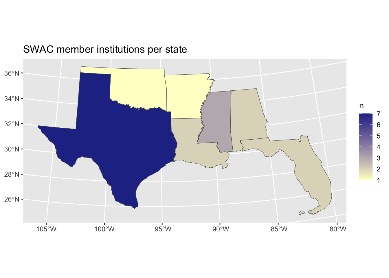
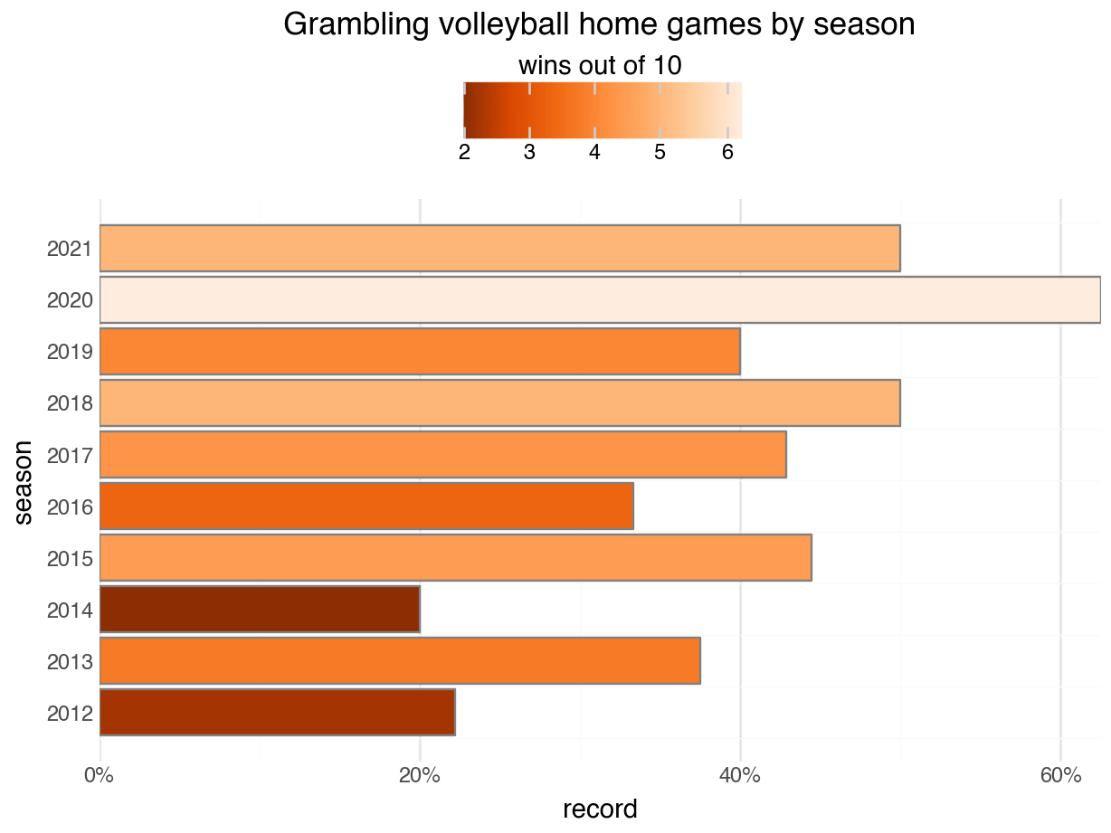
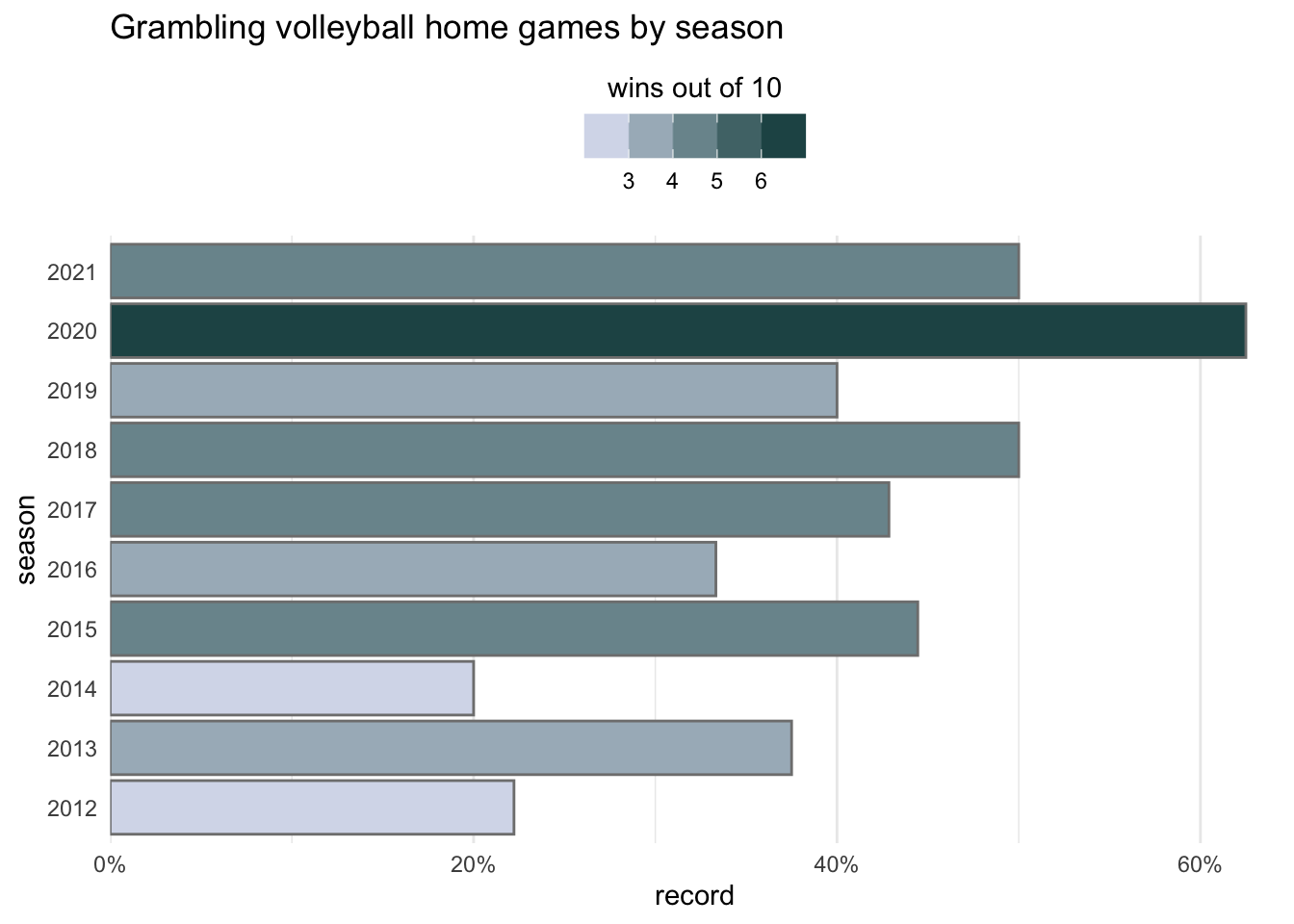
The default sequential scale in {ggplot2} scales different shades of blue:
gram_home_volleyball
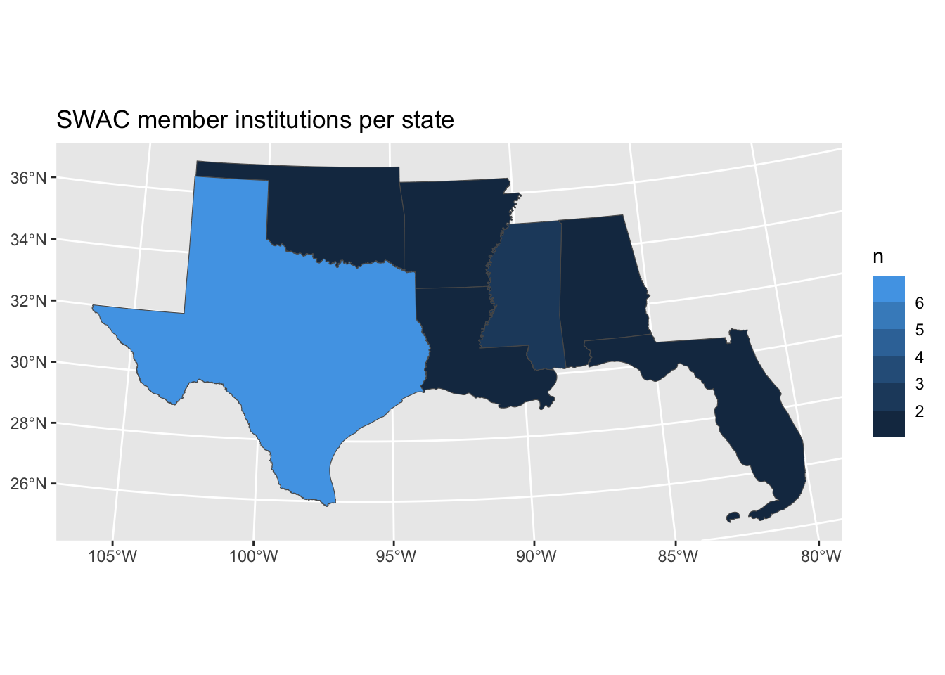
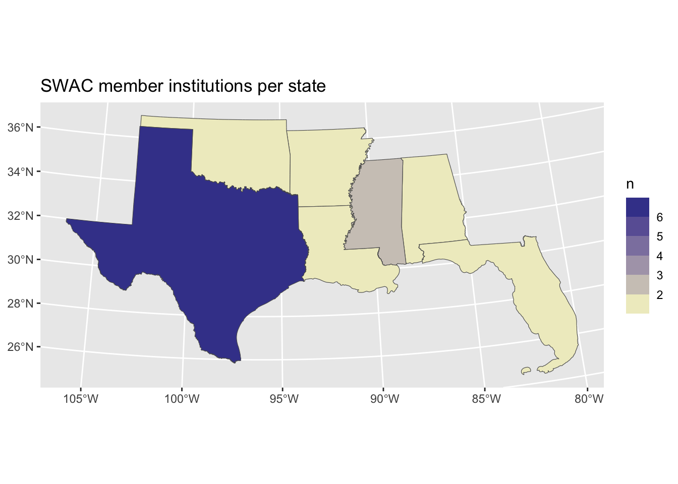
states_by_school_nums
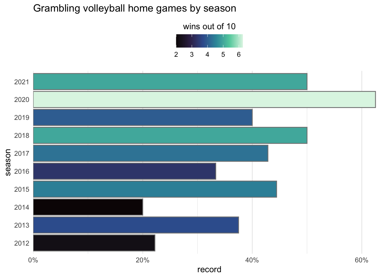
The default sequential scale in {plotnine} is the “viridis” palette:
gram_home_volleyball.show()
The scale_fill_gradient() function allows us to set high and low colors to make sequential color scales. These can be set to named colors like “pink” or hex codes like “#fa9fb5”.
When defining colors, keep in mind the context in which colors will be seen. Higher values might best be indicated by colors that offer the greatest contrast with the background. This principle may go against some default palettes, but it can helpful to think of gradients as scaling from nothing to something.
Continuous gradients like these allow the color scale to show the full distribution of values, but they can sometimes be overly precise. In the next figures, for instance, I can tell that Mississippi is darker than Louisiana, but am I certain that Louisiana is the same color as Alabama? If that level of precision is unnecessary, consider using binned colors.
states_by_school_nums+scale_fill_gradient(low ="#ffffcc", high ="#253494")
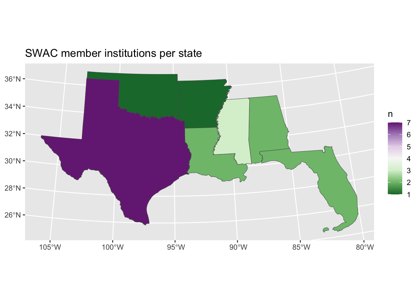
states_by_school_nums+scale_fill_gradient2(low ="#943425", mid ="#ffffcc", high ="#253494", midpoint =3)
(gram_home_volleyball+ p9.scale_fill_gradient( low ="#ddffff", high ="#055555")).show()
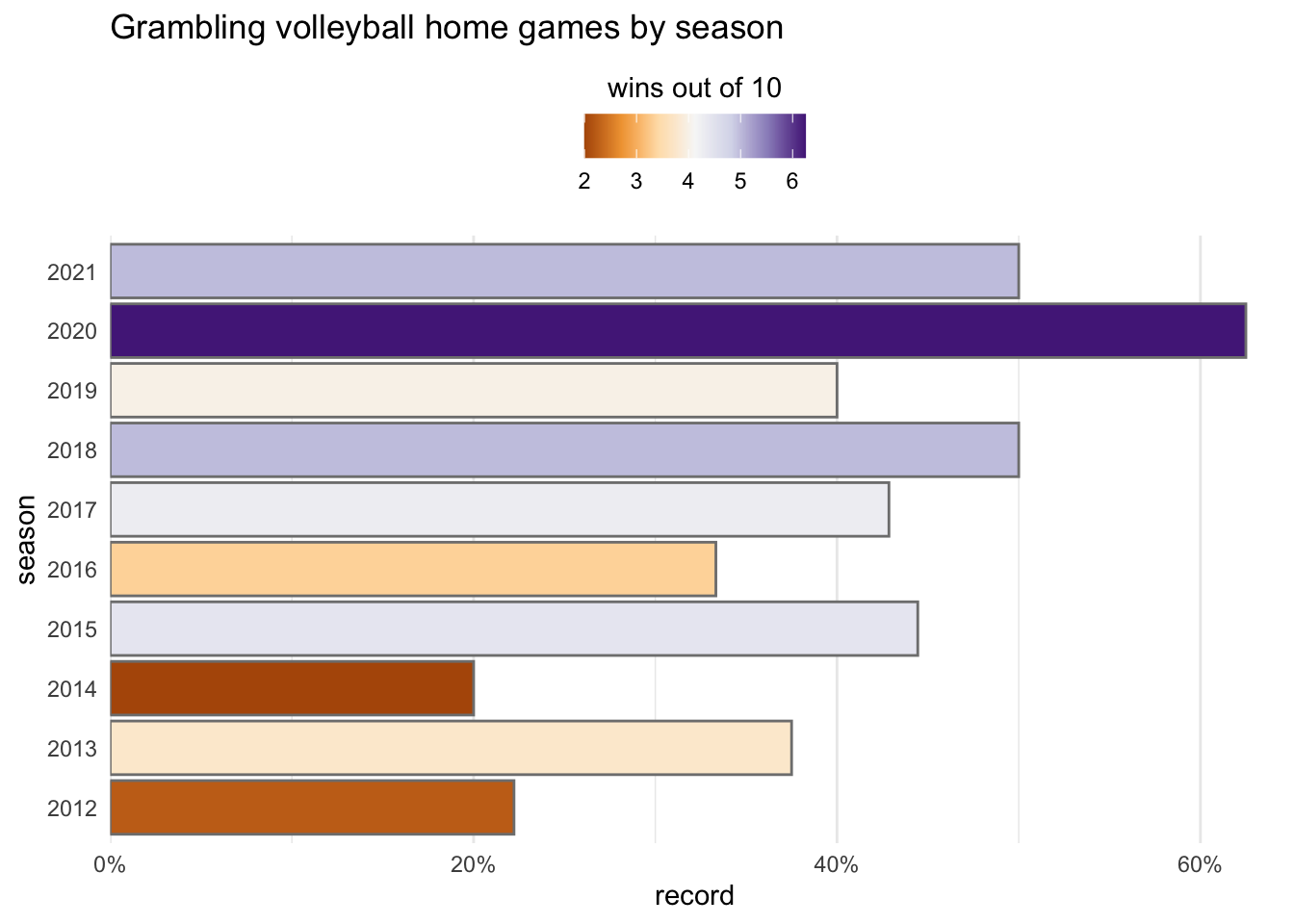
Diverging palettes are defined using scale_fill_gradient2() with added arguments for mid and midpoint:
(gram_home_volleyball+ p9.scale_fill_gradient2( low ="#550555", mid ="#dddddd", high ="#055555", midpoint =5)).show()
Use scale_color_gradientn() to define any number of colors for a scale to pass through.
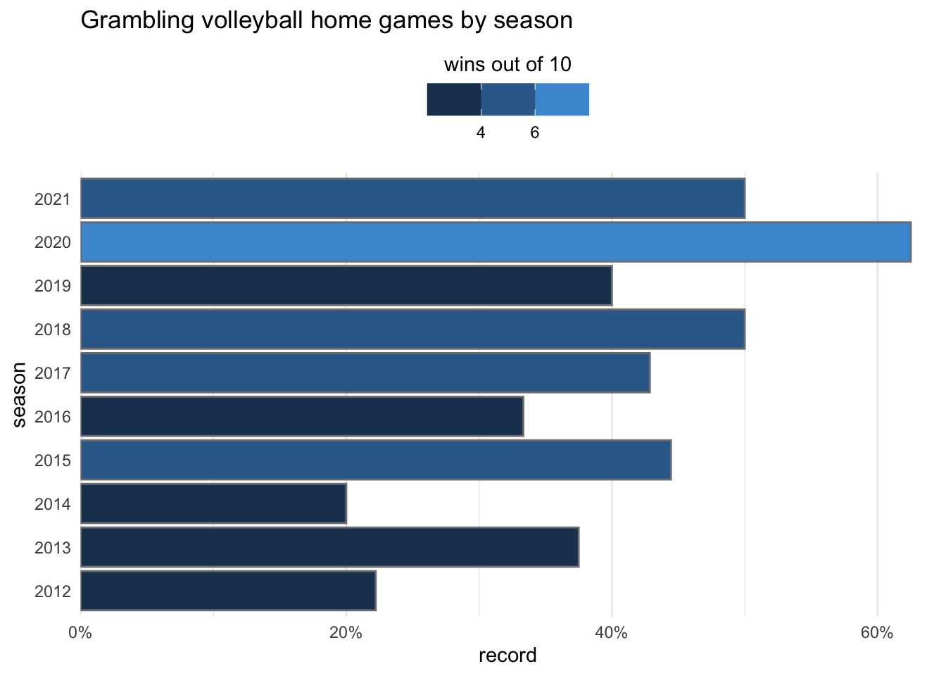
For sequential or divergent palettes to visualize continuous data, use scale_color_distiller() for lines and points, or use scale_fill_distiller() for fills.
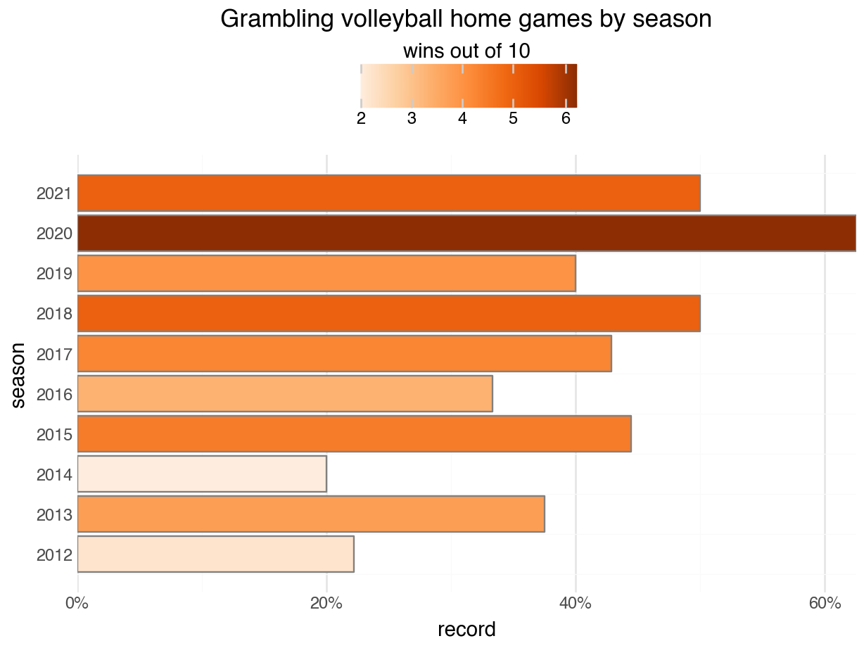
In {plotnine}, the Brewer palettes might use a reversed direction by default, with stronger colors mapped to stronger values.
(gram_home_volleyball+ p9.scale_fill_distiller( direction =-1, palette ="Oranges")).show()
Reverse the default order of Brewer scales by setting negating the direction to -1. In this example, the original ordering with direction = 1 probably makes more sense.
For additional continuous palettes in R, use scale_color_viridis_c() and scale_fill_viridis_c(). Notice that both of these functions ends with c for continuous.
states_by_school_nums+scale_fill_viridis_c(option ="D", direction =-1)
By default, Viridis palettes tend to assign darker colors to lower numbers. On light backgrounds, this can seem unintuitive, since it uses more ink to indicate less value.
gram_home_volleyball+scale_fill_viridis_c(option ="G", direction =-1)
Set direction = -1 to reverse the order of Viridis palettes when that works better for your needs.
For additional continuous palettes in Python, use scale_color_cmap() and scale_fill_cmap(). By default, Matplotlib’s sequential palettes tend to assign darker colors to lower numbers. On light backgrounds, this can seem unintuitive, since it uses more ink to indicate less value.
If it works better for your needs, set the trans argument (for “transform”) to a function like reverse_trans from {mizani.transforms} to reverse the order of a sequential palette made with scale_fill_cmap()
import mizani.transforms as mt(gram_home_volleyball+ p9.scale_fill_cmap( cmap_name ="magma", trans = mt.reverse_trans)).show()
Even better, many of these Matplotlib palettes have a reversed variant that are named by adding _r to the end:
Instead of using a sliding scale, numerical data is sometimes categorized in ordered groups. Using color with binned data conveys both order and grouping.
Caution
{plotnine} does not yet support binned color palettes for visualizing in Python. The following section only applies to visualizations in R using {ggplot2}.
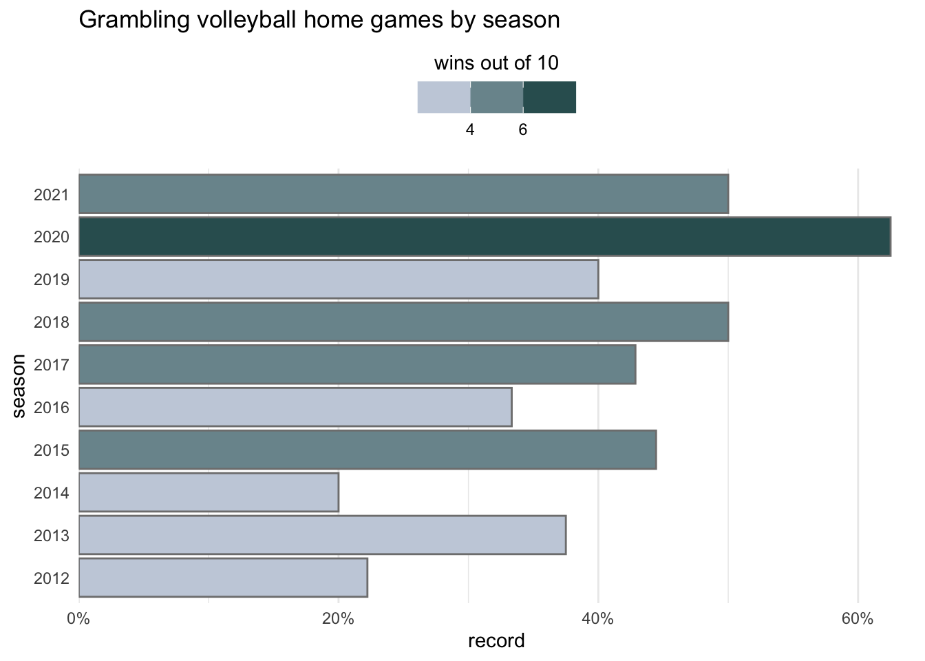
Functioning similarly to scale_fill_gradient(), the scale_fill_steps() function lets us set high and low values, and the scale_fill_steps2() function lets us add a mid. But these show binned colors, with 5 steps by default instead of a constant gradient. Compare the legend in a continuous mapping with that of one that is binned. In this case, the difference is subtle—the range of values in this data set encompasses only five steps.
You can change the number of steps by changing the n.breaks argument inside scale_fill_steps(). To force the number of breaks requested, you may also have to set nice.breaks=FALSE:
Change the number of steps with n.breaks. Sometimes the function will second guess you, but the change can be forced by setting nice.breaks = FALSE.
Breaks won’t always make sense. To force specific break points, set the breaks argument to a vector of values. At the same time, toggling show.limits=TRUE will add values for the lowest and highest numbers, and setting name=NULL will hide the legend title:
states_by_school_nums+scale_fill_steps(high ="#253494", low ="#ffffcc", breaks =c(2,5), show.limits =TRUE, name =NULL)
Other options allow for figures to be polished further.
gram_home_volleyball+scale_fill_steps(low ="#eeeeff", high ="#044444")
gram_home_volleyball+scale_fill_steps(low ="#eeeeff", high ="#044444", n.breaks =3)
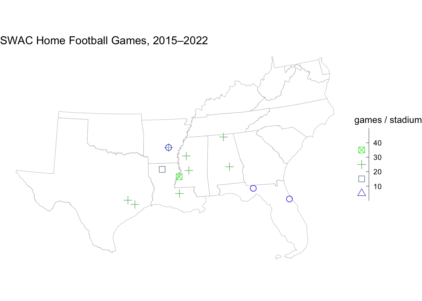
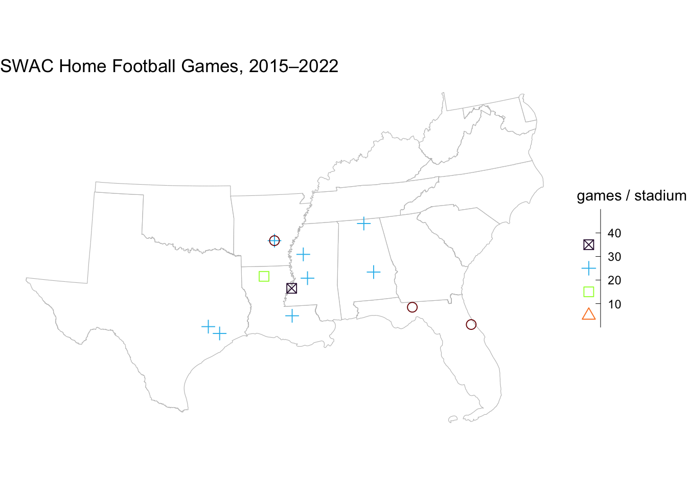
stadium_map_numeric+scale_color_steps(low ="blue", high ="green")+guides(color =guide_bins(reverse =TRUE), shape =guide_bins(reverse =TRUE))
For sequential or divergent binned palettes, use scale_color_fermenter() for lines and points, or use scale_fill_fermenter() for fills.
For binned palettes with Viridis, use scale_color_viridis_b() and scale_fill_viridis_b(). Notice that both of these functions ends with b for binned.
states_by_school_nums+scale_fill_viridis_b(option ="F", direction =-1)
states_by_school_nums+scale_fill_viridis_b(option ="F", direction =-1, breaks =c(2,5), show.limits =TRUE, name =NULL)
gram_home_volleyball+scale_fill_viridis_b(option ="G", direction =-1)
gram_home_volleyball+scale_fill_viridis_b(option ="G", direction =-1, n.breaks =3)
stadium_map_numeric+scale_color_viridis_b(option ="H", direction =-1)+guides(color =guide_bins(reverse =TRUE), shape =guide_bins(reverse =TRUE))
Footnotes
Unlike decimal notation, which uses 10 digits, hexadecimal notation uses 16. The first ten digits run 0 through 9, and the remaining six digits go from A to F, with A representing 10, B representing 11, and so on.↩︎
If you’re more comfortable thinking in percentages, the rgb() function in R will be useful. Feeding this function three arguments will return the corresponding hex code: rgb(red = 0.60, green = 0.00, blue = 1.00) returns “#9900FF”. ↩︎