The R package I wrote for students in my literary text mining class finally feels worth sharing. The package website already details the functions and thinking behind it, so this post will just touch on my four proudest parts.
Project Gutenberg compatibility
I’m a huge fan of the gutenbergr package, which makes Project Gutenberg texts available in R (Johnston and Robinson). Unfortunately, fewer books seem to be available in “.zip” format than there used to be, making gutenbergr downloads fail.
An earlier version of tmtyro’s get_gutenberg_corpus() function addressed this issue by downloading books in “.txt” format instead. Since a .txt file is slightly bigger than a .zip file, tmtyro introduced a 2-second delay between downloads, and it added caching in a local directory.1 The delay adds time to the first download of a corpus, but the caching makes subsequent runs instantaneous. It seemed like a good compromise and felt good to use.
1 gutenbergr’s documentation addresses Project Gutenberg’s rules for robot access, specifically calling out the use of .zip files to minimize bandwidth. But the linked website doesn’t specify using .zip files, so the restriction seems unnecessary. See gutenbergr’s issue #55 on GitHub for more context.
More recently, this function downloads and caches the “.htm” format by default. With this change, tmtyro also uses rvest to parse each book’s structure, identifying headers to find titles of parts and sections (Wickham). It’s now easy to build a corpus from a collection of stories or even from “Collected Works” containing multiple books with chapters.
GIF of RuPaul declaring “The library is officially open”
To illustrate, Oscar Wilde’s novel The Picture of Dorian Gray is found on Project Gutenberg using the identification number 4078 (Wilde). It can be downloaded, read, lemmatized, and readied for analysis by story with a simple workflow:
library(tmtyro)wilde <-get_gutenberg_corpus(4078) |>load_texts(lemma =TRUE) |>drop_na(part) |>identify_by(part)# the top and bottom three rowsrbind(head(wilde, n =3),tail(wilde, n =3))
# A tibble: 6 × 6
  doc_id       title                      author       part         word   lemma
  <fct>        <chr>                      <chr>        <chr>        <chr>  <chr>
1 CHAPTER I    The Picture of Dorian Gray Wilde, Oscar CHAPTER I    3      3
2 CHAPTER I    The Picture of Dorian Gray Wilde, Oscar CHAPTER I    the    the
3 CHAPTER I    The Picture of Dorian Gray Wilde, Oscar CHAPTER I    studio stud…
4 CHAPTER XIII The Picture of Dorian Gray Wilde, Oscar CHAPTER XIII who    who
5 CHAPTER XIII The Picture of Dorian Gray Wilde, Oscar CHAPTER XIII it     it
6 CHAPTER XIII The Picture of Dorian Gray Wilde, Oscar CHAPTER XIII was    be
Drawn from one book on Project Gutenberg, this corpus’s thirteen documents correspond to the book’s thirteen chapters:
unique(wilde$doc_id)
 [1] CHAPTER I    CHAPTER II   CHAPTER III  CHAPTER IV   CHAPTER V
 [6] CHAPTER VI   CHAPTER VII  CHAPTER VIII CHAPTER IX   CHAPTER X
[11] CHAPTER XI   CHAPTER XII  CHAPTER XIII
13 Levels: CHAPTER I CHAPTER II CHAPTER III CHAPTER IV CHAPTER V ... CHAPTER XIII
tmtyro’s compatibility with Project Gutenberg makes it easy to build a corpus of multiple texts or to focus on a chapter-by-chapter analyses of just one volume.
Going generic
The first semester taught me to simplify everything. The second semester taught me the same thing.
We started the second semester with dedicated functions for visualizing already prepared. For instance, when used after measuring word frequencies, plot_doc_word_bars() prepares bar charts of the most frequent words in each document of a corpus. Similarly, used after measuring uniqueness of vocabulary, plot_vocabulary() prepares a line chart showing growth curves from the beginning of a text to its end. But with nearly a dozen of these, I continually tripped myself up, trying to visualize things that weren’t in the data.
The solution was to simplify everything, no matter how much effort it took.
GIF of Dolly Parton saying “It’s amazing how much it costs to make a person look so cheap!” in an interview.
The visualize() function is a generic function that adapts to whatever data it gets. If you count word frequencies and then visualize(), it shows bar charts of word frequencies for every document in a corpus. If you measure vocabulary and then visualize(), it shows growth curves. If you expand a corpus into a document feature matrix and then visualize(), you’ll get a heatmap with colors attuned to frequency. It’s all much simpler.
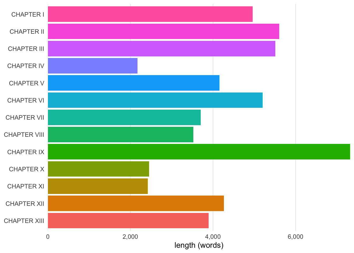
The chapters of Wilde’s novel, for instance, can be visualized quickly with this function. By default, it shows a breakdown of size for each part of the corpus, ordered by each document’s placement in the collection:
wilde |>visualize()
Bar graph of chapter lengths in The Picture of Dorian Gray
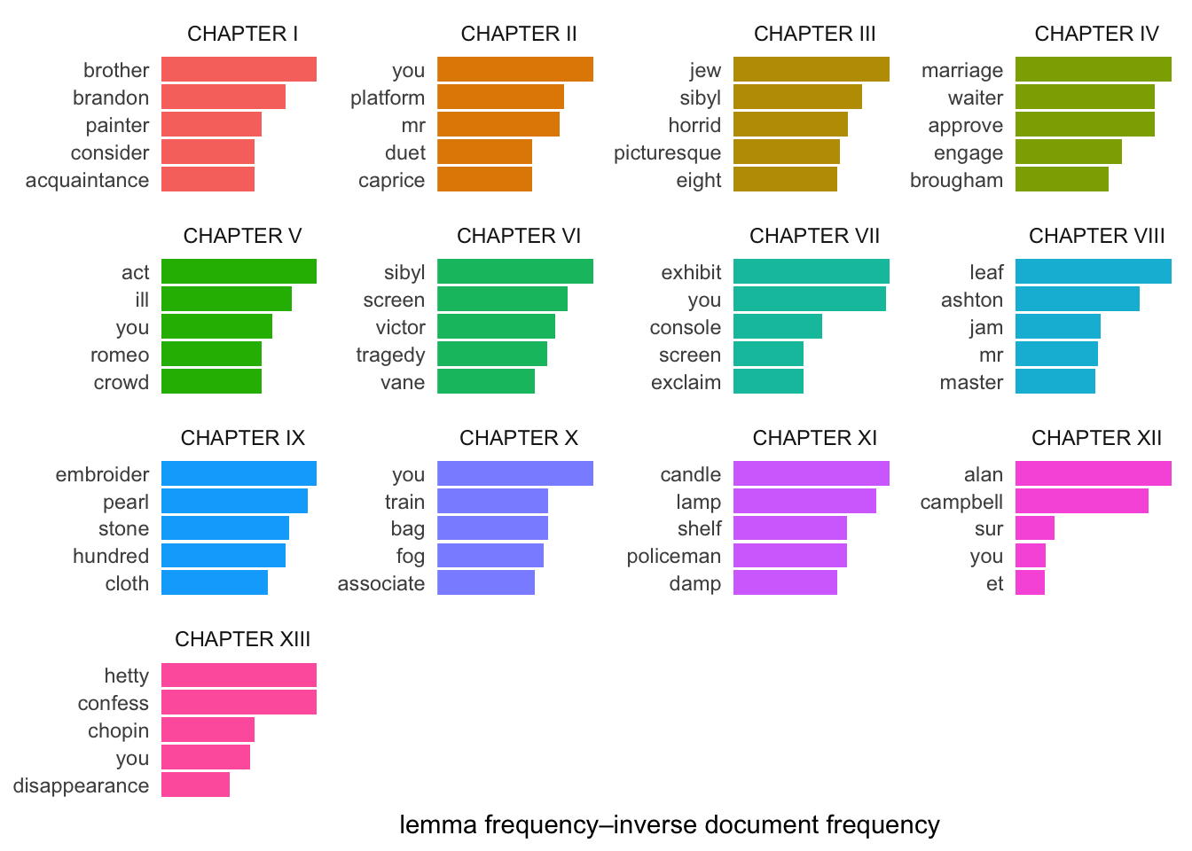
To weight lemmas by tf-idf and visualize the top five words in each is not much harder:
Bar graphs of the top lemmas in each chapter, weighted by tf-idf
Preparing figures with visualize() works so well and makes things so simple that it inspired tabulize() for preparing polished tables. To measure and report on some key metrics of word usage takes just two steps:
wilde |>add_vocabulary() |>tabulize()
length
vocabulary
hapax
total
ratio
total
ratio
CHAPTER I
4,961
1,265
0.255
784
0.158
CHAPTER II
5,604
1,274
0.227
755
0.135
CHAPTER III
5,508
1,360
0.247
835
0.152
CHAPTER IV
2,171
678
0.312
415
0.191
CHAPTER V
4,152
1,124
0.271
700
0.169
CHAPTER VI
5,202
1,248
0.240
739
0.142
CHAPTER VII
3,702
879
0.237
511
0.138
CHAPTER VIII
3,522
1,054
0.299
689
0.196
CHAPTER IX
7,321
2,148
0.293
1,455
0.199
CHAPTER X
2,454
703
0.286
414
0.169
CHAPTER XI
2,422
788
0.325
504
0.208
CHAPTER XII
4,262
1,169
0.274
738
0.173
CHAPTER XIII
3,895
991
0.254
583
0.150
These are my first generic functions, but they already have me scheming others. I put a lot of effort into making things effortless, but I’m proud of the way they turned out.
Changing colors
It’s a small detail, but students liked choosing colors for their visualizations. The change_colors() function made that easy, adjusting the fill or color aesthetics of ggplot2 as needed and simply handling things for a wide array of palettes.
GIF of Thorgy Thor saying “Love Pink” (after initially saying “I really just don’t like her.”)
Brewer color palettes, for example, are nice, but their function names are wildly unintuitive: scale_color_brewer() is used for categorical data, scale_color_distiller() for continuous data, and scale_color_fermenter() for binned palettes. I never forget that one is called “Brewer,” but I’m less successful in recalling “Distiller” and “Fermenter,” and I’m mostly wrong in remembering which does what.2
2 There’s not yet any support for binned palettes in tmtyro’s change_colors() function, but I’m adding it to the list now!
change_colors() supports Brewer intuitively, applying a standard interface for palettes typically accessed by many different functions: scale_color_brewer(), scale_color_distiller(), scale_color_viridis_c(), scale_color_viridis_d(), scale_color_manual(), scale_color_gradientn(), and all their _fill_ counterparts.
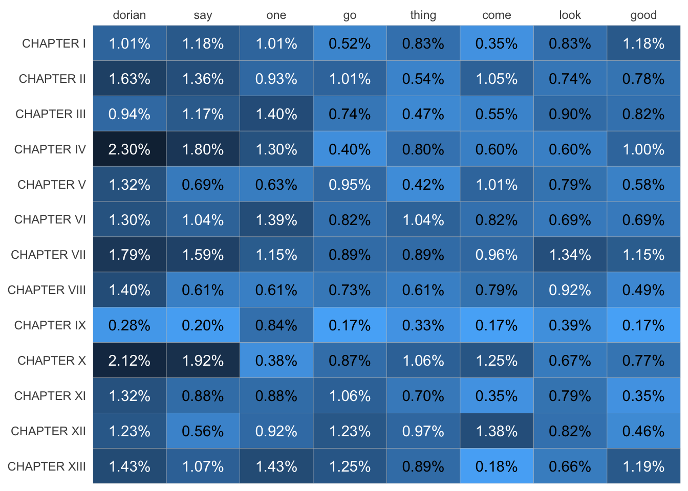
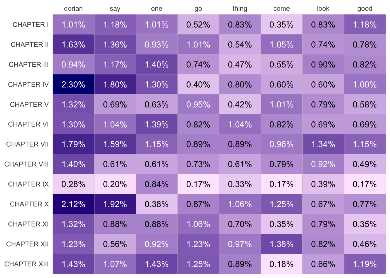
To see it in action, compare the default heatmap made from lemma frequencies with stopwords removed:
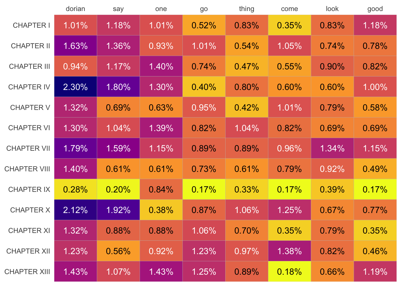
The same data using different colors. This heatmap uses Viridis’s “plasma” palette.
heatmap |>change_colors(c("navy", "#FFE8FF"))
The same data using different colors. This heatmap uses custom colors, transitioning from navy to a very faint pink.
Not needing to know the difference between “Brewer” and “Malter” and “Condenser” has been a relief, but having equal access to any other palette is a treat. I also felt a satisfying thrill at finally getting the function to work the way I imagined.
The convenience already has me wanting to use the function regularly in my other projects, so it might be something that outgrows tmtyro.
Meeting needs
tmtyro was developed over two semesters of the course while students used it for class. Like any organism living in an extreme environment, it evolved when things went weird.
For the first semester the course ran, students faced a dizzying couple of weeks that introduced R, including readLines() to read in a text file, data.frame() to introduce structure, mutate() to adjust columns, and unnest_tokens() to separate lines into words. They made it, but the time was spent inefficiently, not least because these weeks ended with custom functions made to skip such cumbersome steps.
The second semester benefited from my hindsight, and students learned a single function to load texts: load_texts(). Because this second running of the class was designed with the package already well underway, everything progressed more smoothly. We spent less time with code frustrations and more time thinking about what new methods might reveal about the things we were studying.
These changes were important because they helped us keep our focus. They did what needed to be done! Although the class is an elective students can choose in Grambling’s program in data analytics, it’s primarily an English course, offered in that department and serving many students who’ve never coded before. The package worked well for them, providing simpler workflows for beginners.
Not so secretly, I’ve also found these workflows useful for myself.
GIF of Law Roach delivering his signature line, “You did what needed to be done.”


