For the past few years, I’ve been using the R package stylo1 to study authorship in early modern texts and style in twentieth-century texts.2 The package is incredibly useful for gathering word frequencies from a collection of texts and visualizing them a number of ways, and the single stylo() function handles everything from assaying texts to storing frequencies and visualizing the resulting data.
Stylo makes it very easy to make very good visualizations from these frequency tables, but sometimes my process is not typical: combining two frequency tables into one analysis is easy using R, but it is not obvious then to visualize with stylo; dropping one text from an existing table is easy with dplyr, but then I’m impatient about seeing my results; grouping texts by some measure other than the scheme of their filenames is tempting and occasionally necessary.
And I don’t understand plotting in base R graphics.
I began using ggplot23 to plot analyses that needed intermediate steps. And since I used ggplot2 for these analyses, I also began regularly converting even my simpler explorations to ggplot2 so that my figures would look consistent. After too many manual iterations of this process—extracting a table, normalizing it, completing any intermediate analyses, reordering everything in an appropriate format, and then piping it into a visualization—it eventually dawned on me how much time I was wasting by not doing everything with a function.
So I wrote stylo2gg.4 Using stylo it’s already easy to store frequencies of a feature set in a given corpus once, and using stylo2gg it’s easy to prepare multiple visualizations from that single measurement. Moreover, moving visualizations from base R graphics to ggplot2 opens up a range of advanced customizations and add-ons. Uses and examples of stylo2gg are included below.
1 Showing principal components analysis
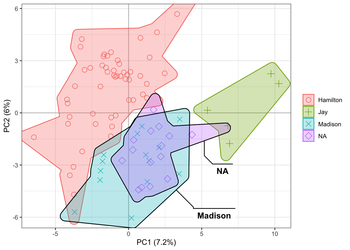
Stylo has incredibly useful visualizations built in. The stylo() function itself offers options of visualizing stylometric data using techniques like principal components analysis and hierarchical clustering. As an example, here’s the code and output from rendering the eighty-five Federalist Papers, most of which were known to be written by Alexander Hamilton, John Jay, and James Madison (all shown categorically here by their last names), and some of which once had disputed or joint authorship (shown here by the “NA” category):
This visualization places each part by its frequencies of 120 of the most frequent words—chosen from among words appearing in at least three-fourths of all papers The chart shows that the texts whose authorship had once been in question, shown here in green crosses, have frequency distributions most similar to those by James Madison, shown here with red Xs.
Unsurprisingly, the disputed and jointly-authored papers seem closest in style to those by James Madison—“unsurprisingly” because these findings match those of Frederick Mosteller and David Wallace in their 1963 study of The Federalist Papers.5 But while the analysis here uses some of the same measures they famously used, the ease and usefulness of tools like stylo means that preparing this quick visualization demanded far less time and sweat.
In saving this output to a named object federalist_mfw, stylo makes it possible to access the frequency tables to study them in other ways. By taking advantage of this object, stylo2gg makes it very easy to try out different visualizations. Without any changed parameters, the stylo2gg() function will import defaults from the call used to run stylo():
library(stylo2gg)federalist_mfw %>%stylo2gg()
Using selected ggplot2 defaults for shapes and colors, the visualization created by stylo2gg nevertheless shows the same patterns of style, presenting a figure drawn from the same principal components. Here, the disputed papers are marked by purple diamonds, and they seem closest in style to the parts known to be by Madison, marked by blue Xs.
In the simplest conversion of a stylo object, stylo2gg tries as closely as is reasonable to recreate the analytic and aesthetic decisions that went into the creation of that object, creating a chart comparing first and second principal components with axes marked by each’s distributed percentage of variation; the caption shows the feature count, feature type, culling percentage, and matrix type; and the legend is shown at the top of the graph. Stylo2gg even honors the choice from the original stylo() call to show principal components derived from a correlation matrix, though this isn’t the only option available.
1.1 Labeling points
From here, it’s easy to change options to clarify an analysis without having to call stylo() again. Files prepared for stylo typically follow a specific naming convention: in the case of this corpus, Federalist No. 10 is prepared in a text file called Madison_10.txt, indicating metadata offset by underscores, with the author name coming first and the title or textual marker coming next. Stylo already uses the first part of this metadata to apply color to different authors or class groupings of texts. Stylo2gg follows suit, but it can also choose among these aspects to apply a label. For this chart, it might make sense to replace symbols with the number of each paper it represents:
The option shapes=FALSE turns off the symbols that would otherwise also appear; simultaneously, the option labeling=2 selects the second metadata element from corpus filenames—in this case the number of the specific paper—as a label for the visualization. When a chosen label consists of nothing but numbers, as it does here, the legend key changes to a number sign; if a label includes any other characters, it becomes the letter “a”, ggplot2’s default key for showing color of text.
Displaying these labels makes it possible further to study Mosteller and Wallace’s findings on the papers jointly authored by Madison and Hamilton: in this principal components analysis of 120 most frequent words, papers 18, 19, and 20 seem closer in style to Madison than to Hamilton, and Mosteller and Wallace’s work using different techniques seems to show the same finding for two of these three papers, with mixed results for number 20.
If we preferred instead to label the author names, we could set labeling=1. If we wanted to show everything, replicating stylo’s option pca.visual.flavour="labels", we can set labeling=0:
The option labeling=0 shows entire file names for items in the corpus, excepting the extension. This option also turns off the legend by default, since that information is indicated.
1.2 Highlighting groups
In addition to recreating some of the visualizations offered by stylo, stylo2gg takes advantage of ggplot2’s extensibility to offer additional options. If, for instance, we want to emphasize the overlap of style among the disputed papers and those by Madison, it’s easy to show a highlight of the 3rd and 4th categories of texts (corresponding to their orders on the legend):
The highlight option accepts numbers corresponding to categories shown on the legend. Highlights on principal components charts can include 1 or more categories, but highlights for hierarchical clusters can only accept one category. To draw these loops around points on a scatterplot, stylogg relies on the ggalt package.
1.3 Overlay loadings
With these texts charted, we might want to communicate something about the underlying word frequencies that inform their placement. The top.loadings option allows us to show a number of words—ordered from the most frequent to the least frequent—overlaid with scaled vectors as alternative axes on the principal components chart:
Set top.loadings to a number n to overlay loadings for the most frequent words, from 1 to n. This chart shows loadings and scaled vectors for the 10 most frequent words.
Alternatively, show loadings by nearest principal components, by the middle point of a given category, by a specific word, or all of the above:
In a list form, the select.loadings option accepts coordinates, category names, and words. Here, c(-4,-6) indicates that the code should find the loading nearest to -4 on the first principal component and -6 on the second principal component; "Madison" indicates that the function should find coordinates at the middle of papers by Madison and then find the loading nearest those coordinates; and three articles “the,” “a,” and “an” indicate, using call("word"), that these specific loadings should be shown.
1.4 Narrowing things down
One beauty of using a saved frequency list is that it makes it possible to select a subset from the data to inform an analysis. By counting all words that appear in 75% of the texts for this analysis, stylo prepares a frequency table of 120 words, but we can even select a subset of these using the features option (for selecting a specific vector of words) or the num.features option (for automatically selecting a given number of the most frequent words).
I might, for instance, hypothesize that words shorter than 4 characters are sufficient to differentiate style in these English texts.6 Using the features option, I might test this hypothesis by choosing a smaller subset from the full list of 120 most frequent words:
Selecting a subset of features will also cause the caption to update from “120 MFW” to “42 W,” reflecting the changed number of features and the type: they are no longer most frequent words (MFW) but are now just words (W).
Results here suggest that my hypothesis would have been mostly correct, as it’s possible still to see patterns in clusters. But it’s mostly harder to differentiate the styles of Hamilton and Madison when looking only at these shorter words. Interestingly, Jay’s style remains distinct in this consideration. Interesting, too, the overlay of the top ten loadings shows that papers with positive values in the second principal component in this chart—above a center line—are strongest in first-person plural features like “us” and “our” and “we.” And perhaps most interesting, just quickly looking at the top ten loadings suggests that Hamilton’s papers may have been less likely to use past-tense constructions like “was” and “had,” preferring infinitive forms marked by “to” and “be.”
If instead of manually selecting features I wanted to choose a subset by number, the num.features option makes it possible.7
Setting num.features to 50 will limit a chart to the 50 most frequent words. The caption updates to reflect this choice.
This last visualization also shows that, in addition to a number corresponding to the metadata from a filename, the labeling option can also accept a vector of the same length as the number of texts. Here, I’ve elected to show the first letter of each author category, a dot, and the text’s corresponding number; additionally, I’ve turned off the legend by setting its option to FALSE.
1.5 Emphasizing with contrast
By default, stylo2gg uses symbols that ought to be distinguishable when printing in gray scale. But to optimize for a situation lacking color, or to employ contrast to emphasize a particular group, use the black= option, along with the number of a given category.
federalist_mfw %>%stylo2gg(black =4)
1.6 Other options for principal components analysis
In addition to the options shown above, principal components analysis can be directed with a covariance matrix (viz = "PCV) or correlation matrix (viz = "PCV), and a given chart can be flipped horizontally (with invert.x=TRUE) or vertically (invert.y=TRUE). Additionally, the caption below the chart can be removed using caption=FALSE. Alternatively, setting viz="pca" will choose a minimal set of changes from which one might choose to build up selected additions: turning on captions (caption=TRUE), moving the legend or calling on other ggplot2 commands, adding a title (using title="Title Goes Here"), or other matters.
federalist_mfw %>%stylo2gg(viz ="pca") +theme(legend.position ="bottom") +scale_size_manual(values =c(8.5,9,7,10)) +scale_shape_manual(values =15:18) +scale_alpha_manual(values =rep(.5,4)) +labs(title ="Larger, solid points make the data easier to see.",subtitle ="Setting alpha values is a good idea when solid points overlap.") +theme(plot.title.position ="plot")
Setting viz=pca rather than the stylo-flavored viz="PCR" or viz="PCV" prepares a minimal visualization of a principal components analysis derived from a correlation matrix. This might be a good setting to use if further customizing the figure by adding refinements provided by ggplot2 functions.
2 Showing hierarchical clustering
In addition to visualizing by reducing dimensions via principal components analysis, stylo can alternatively show texts’ relationships based on their distance to each other. The resulting dendrogram shows texts in a cluster analysis, with branches splitting off from one another at points that correspond to distance: in the orientation shown below, when two texts or groups of texts seem to have greater stylistic similarity, their branches will join nearer to the right side of the chart—nearer to a distance of zero. As the texts show greater dissimilarity, their branches will connect closer to the left side of the chart.
Using the same federalist_mfw object saved earlier, stylo2gg will create a similar cluster analysis using the option viz="CA":
federalist_mfw %>%stylo2gg(viz ="CA")
To prepare dendrograms for display, stylo2gg uses dendextend.
The addition of symbols to the chart allows for interpretability when printing, though these can be turned off with shapes=FALSE, as they can when showing PCA. In fact, many of the same options that apply to a visualization of principal components will also apply to cluster analysis:
Stylo2gg will adopt stylo’s settings for measuring distances and finding groups if they are available. If they’re not available, it will default to finding distance using the Burrows delta (distance.measure="delta") and grouping texts using the Ward1 method (linkage="ward.D"); many options native to stylo and to R can be set for these.
2.2 Minimal display
When setting viz="CA" or importing directly from a stylo analysis with the option set analysis.type="CA", stylo2gg will try to approximate the aesthetics shown by stylo, displaying an axis of distance and an explanatory caption. These options may not be desired since relative distances are already meaningful without the axis. To show a minimal dendrogram, choose the option viz="hc" (for hierarchical clustering)
This minimal dendrogram shows clusters using the Ward2 method based on Euclidean distances. If labels get clipped at the edge, consider expanding the limits using the added function shown here.
2.3 Highlighting results with boxes
As shown above, setting the highlight option to a category’s number will draw a box around the branches containing this category. Unlike with principal components visualization, only one category can be highlighted at a time on a dendrogram; nevertheless, there are a few more options available to tweak this highlighting.
By default, stylo2gg will draw a single box, even if texts belonging to a category are distributed unevenly.
Drawing a highlight box when texts are distributed widely isn’t very useful. The highlight.nudge option here moves the box’s edge to avoid clipping labels.
Setting highlight.single=FALSE will instead draw multiple boxes while consolidating any contiguous branches:
As an alternative to categorical highlighting on a dendrogram, stylo2gg can draw boxes indicated by each text’s index number from the bottom, with the lowest text being number 1, the second-lowest text number 2, etc:
In addition to the options accommodated by stylo2gg, visualizations benefit from the conversion to the ggplot2 system over base graphics. Options like theming, transparency, and symbol shape and size behave as they do with any other ggplot2 plot, giving one access to many useful functions for communicating findings.
Changing ylim() and xlim() allows you to zoom in on a particular region.
Additionally, ggplot2 makes it easy to add layers, imagining new ways of communicating an idea—for example, by using density overlays to indicate how Hamilton’s typical style is distinct from the style of the disputed papers:
The plot created by stylo2gg() passes along the variable class used for the categorical grouping.
Most usefully, the conversion to ggplot2 allows visualizations to benefit from a universe of package add-ons like “ggforce,” which opens up many more options and customizations than could ever be considered in a single package devoted to stylometry:
Many other extensions to ggplot2 are available.8 Although they’re not all appropriate for stylometry, and although they won’t all be compatible with stylo2gg’s data structure, it’s promising to see that some like ggforce work instantly.
4 Coda
Making stylo2gg did not only simplify some of the steps I needed to undertake my analyses—though it did that, too. It also provided the opportunity to get “under the hood” of the stylo package and to see how it works. As a project, making stylo2gg offered a chance to tinker as a mechanic, breaking apart and then building back up some of these methods I’d learned to use but not to appreciate: figuring out how to plot loadings on a PCA chart introduced me to the values that went into them and made me think of the data space from a different perspective; studying clustering methods led me to understand how they’re conceptualized beyond simply being called as options in a function, which in turn helped me better understand the differences they make when studying style. And preparing the code as a package in order to keep my general methodology pure, distinct from any specific use, forced me to improve as a coder.
This project has been one of the most satisfying I’ve done in awhile, and it’s been useful in a lot of my work over the past few years. I hope it might also be useful to others.
Footnotes
Maciej Eder, Jan Rybicki, and Mike Kestemont, “Stylometry with R: A Package for Computational Text Analysis,” R Journal, vol. 8, no. 1 (2016): 107-121.↩︎
I learned about stylometry and the stylo package from one of its authors, Maciej Eder, by taking a class he taught at DHSI in 2017. It was a very well organized class, and I learned a lot in one week!↩︎
Hadley Wickham, ggplot2: Elegant Graphics for Data Analysis, Springer-Verlag, New York, 2016.↩︎
What started as just a function in a Gist is now a package that can be installed from GitHub using remotes with the following command: install_github("jmclawson/stylo2gg")↩︎
Mosteller and Wallace write of being surprised that “high-frequency function words did the best job” (304), and their findings of this tendency in English texts have been confirmed many times over since then.↩︎
Currently, stylo2gg should be limited to a subset of the features originally chosen by stylo, but, since stylo also saves a much larger table of frequencies, this might change.↩︎